Increasing the Discoverability of Setouchi City for Overseas Travelers
Role
Research, wire framing, UX design, UI design, content writing, prototyping, Framer development, usability testing
Year
2025
Team
Myself + one member from Setouchi City Hall

Overview
Setouchi's online presence must be reborn
Website went offline in 2020, leaving international visitors unable to discover the destination
Designed and built the new website that serves Western travelers' needs while being maintainable by non-technical local staff
Delivered the city's first reliable English resource in 5 years, improving discoverability for overseas visitors
Click for the TL;DR
Key Insights
2 pain points from article research
Language gaps = no discovery or trust
Rural areas still lack consistent multilingual resources in the digital space. Even with machine translations (when offered), the information is often incomplete or inaccurate.
Poor info. design = missed experiences
Tourists often miss out on local events, workshops, etc, because essential details (time, location, how to join) are difficult to locate in the website.

4 qualities of strong tourism websites
Use good quality images and tailored copywriting to give the location a strong identity
Clear information on what the area will be like depending on the time of year you visit, in addition to interactive maps
Highlight upcoming and yearly events with ample descriptions, appealing to overseas visitors
All important information is quick and easy to navigate to on the website. Users aren't overloaded with walls of text

Ideation
Homepage as the foundation
Through brainstorming, sketching and implementing AIDA principles, I decided to focus on the homepage's direction as it would lead the website's overall design, content structure, and flow. I concluded it would highlight:
Top 5 Activities: Quick suggestions to reduce thinking time
6 Categories: Encourages exploration based on users' interests
Interactive Map: Orients users and gives information on the 3 distinct regions
Seasonal Recommendations: Insights to local seasonal activities (based on current season)
Local Events: Shows when and how users can connect with the locals
Peek at Stays: Invites one to spend more time in Setouchi


2

3
4
1
AIDA led me to highlight the 3 unique regions of the city, top things to do, experience categories, and events
2
I identified what action I wanted users to take in each section of the homepage, and how those actions would lead them to other areas of the website
3
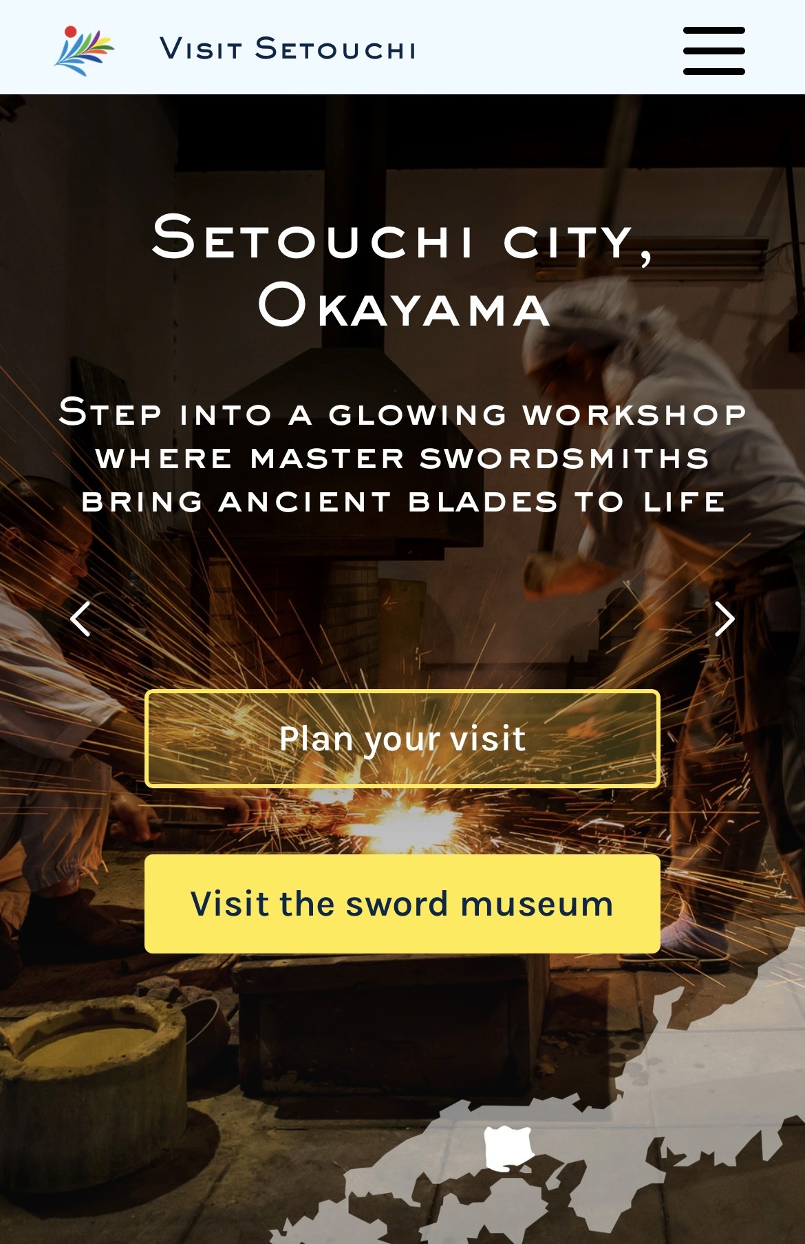
I concluded that the top navigation categories for the website would be: regions, stays, experiences, food, and trip planning (later, a new section introducing custom swords was added per the client's request)
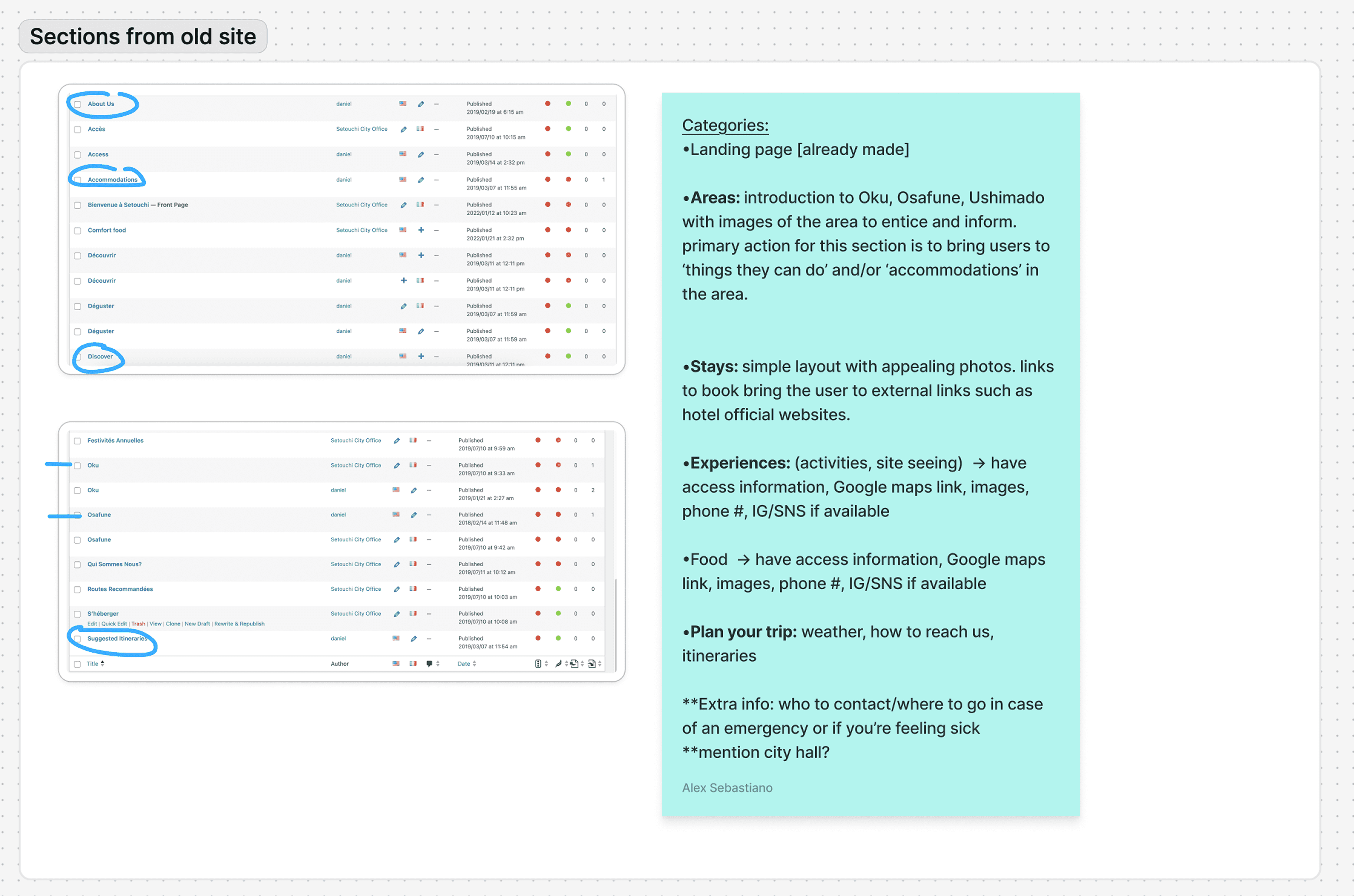
4
By analyzing content from the old website I decided that some content could be reused for the new site: regional information, food, and itineraries
Final Design
No code design & build
The new website had to close language gaps while avoiding information overload. I designed sections that showcase Setouchi's distinct identity, local involvement opportunities, and clear timing/location information—directly addressing the pain points identified in research.
The website was fully designed and built in Framer, with no code (only low-fidelity wireframes were created in Figma first). This exciting design challenge allowed me to immediately test the site and publish quickly.


User Testing Insights
"If I go here, I feel like I can experience things I never have before."
They were unsure of how to exit and return to the previous screen
80%
of users had difficulties navigating overlays
when exploring the "city area" pages, they weren't sure where in Setouchi they were
60%
of users were geographically lost
they would have liked more details and direct contact with someone to help plan their trip
60%
of users wanted more clarity on trip planning
The eye-catching images and layout intrigued users to visit in the near future
80%
of users were drawn to the images & layout
knowing that they could interact and partake in local activities with the community made them want to visit
100%
of users were attracted to local participation
after using the website, they fully understood what Setouchi offers and what makes it unique
100%
of users could easily describe the city's identity
Learnings
Navigating constraints & taking on multiple roles
Designed effectively within no-code constraints. Some of the interactive feature limitations taught me that reducing complexity can enhance user value.
Developed communication skills with non-technical government stakeholders. I framed decisions using outcome-focused language like 'faster trip planning' instead of design jargon.
Government projects can move slowly, so getting access to archives and permissions pushes the timeline. I worked around this block by focusing on other tasks and flexibly adjusting the deadline.
Adapted and strategically pivoted when the client presented a last-minute request: a new page featuring custom swords for which people can place orders.