


Filling a Need for UNESCO world Heritage Enthusiasts
Role (redesign)
Research, wire framing, UX design, UI design, content writing, prototyping, usability testing
Timeline
2 months; throughout 2024
Team
Myself
Video: The final design prototype
Overview
Reimagining the world heritage experience
Brief:
A redesign of a third-party UNESCO mobile app focused on discovering, learning about, and tracking UNESCO World Heritage Sites in a clear and engaging way. UNESCO does not have an official app, which is why there are only 3rd party options available.
Challenge:
There is no centralized, well-designed app experience for exploring UNESCO World Heritage Sites. Existing options such as the official UNESCO website, Google Maps, and a third-party app, are difficult to navigate, inconsistent in quality, and lack engaging educational experiences. This project focuses solely on the redesign of a third-party app to highlight its potential and what UNESCO could try implementing in the future.
Impact:
The goal of the redesign is to accurately convey information, improve discoverability, and make learning about World Heritage Sites more immersive. It also explores opportunities for creating a community around shared cultural and travel interests.
A redesign of a third-party UNESCO mobile app to help users discover, learn about, and track World Heritage Sites in a clear, engaging way that connects them to an active community
Existing options are hard to navigate, lack community and are not engaging
Click for the TL;DR
Key Insights
2 glaring pain points in the chaos and confusion
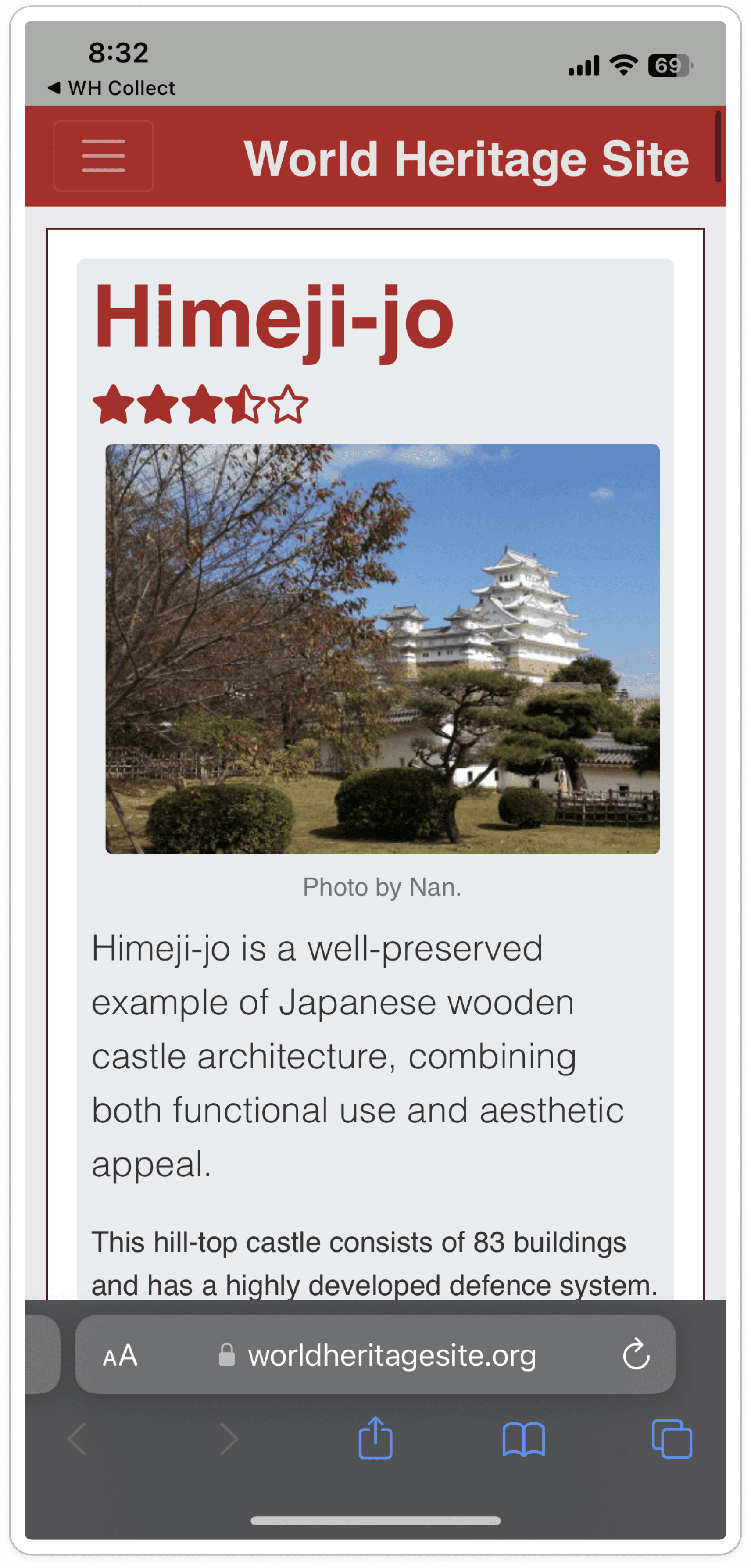
There are too many colors, weak visual hierarchy and no brand identity. Plus, the layouts are cluttered with an outdated aesthetic. The poor typography and overwhelming amount of information leads the user to exhaustion. Lastly, the low-quality images and certain page sections looks like advertisements.
Weak navigation & information architecture
The cluttered header and duplicated navigation elements causes friction and hesitation. Also, the purpose of "The List" as the first screen and the numbers on the map are unclear.


4 areas competitors get it right
Strong organization & simplicity
Text is organized in scannable chunks with high quality images and simple navigation is possible with a simple filtering system
Engaging content
They make discoverability entertaining and the learning process doesn't feel like a chore; maps are interactive
Solid functionality
Users can achieve the tasks they set out to do with the apps without running into experiences with friction
Clear branding
Purpose of the organizations and how they can better help serve the user needs is clearly conveyed; colors aren't overwhelm
The 5 Competitor Apps
Google Arts and Culture

The Michelin Guide

Geo Catching

Triptastic

Culture Trip


Ideation
I needed to focus on discoverability and community?
Through brainstorming, sketching and competitor analysis results, I selected four areas where the redesign needed to improve.
Featured Location: Introducing lesser known heritage sites to promote discoverability and education, improving the features from the 3rd party app
Categories: Improving heritage site categorization and filtering to make navigation and discoverability easier
Community: Connect and create a community for users who have a shared passion. which further encourages use of the app. *This is currently unavailable in the 3rd party app.
Tracking & Lists: Further develop the way users track locations they've been to and want to visit, plus allow them to create custom lists

1

2
1
I sketched a potential layout for showcasing a featured world heritage site on the top with the categories on the bottom. This layout felt too tight so I decided against it.
2
I sketched the categories and made them smaller, similar to pills but this design didn't show the importance of exploring and discovering the world heritage sites
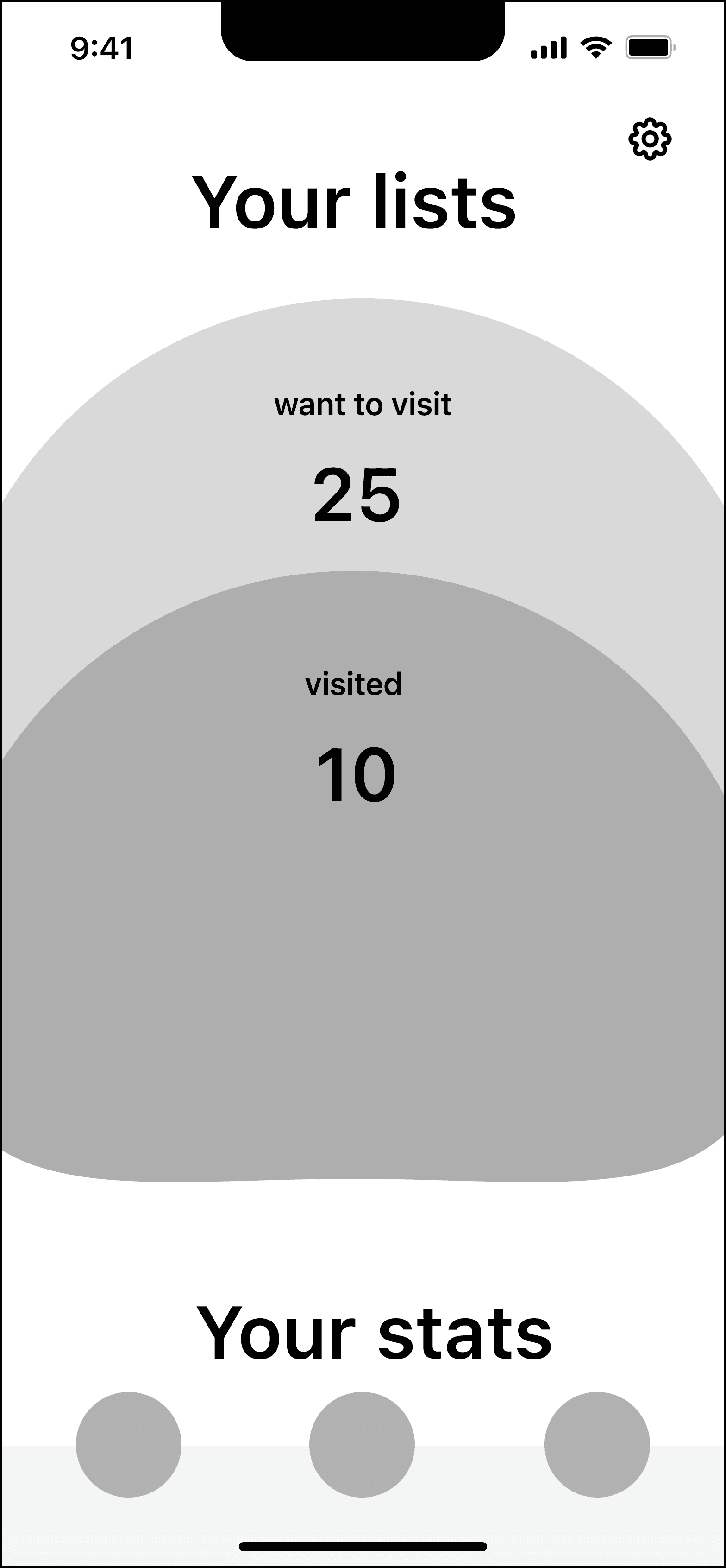
Experimenting with tracking and statistics
I created two different layout options for showing users how many specific types of UNESCO world heritage site they've visited so far.
Left wireframe: Category circles that grow each time a user checks off if they’ve visited the site
Right wireframe: Growing circles concept with "Want to visit" and "Visited" sites
However, I realized that this design may present issues for a future dev team by taking too much time and resources to create. *But I did keep the idea of circles for tracking in the final design

Final Design
A digital UNESCO community for discoverability, education, and tracking
The redesign transforms a cluttered heritage site app into an engaging community platform that makes exploring all 1,154 UNESCO sites feel like an enjoyable, personalized journey.
With curated weekly features, scannable content hierarchy, and dual map/list navigation, users can easily discover and learn about heritage sites. A gamified achievement system with visual progress in the form of badges and stat circles, motivates users to move from passive browsing to real life visits. The community features like comments and shared experiences create connections among heritage enthusiasts.

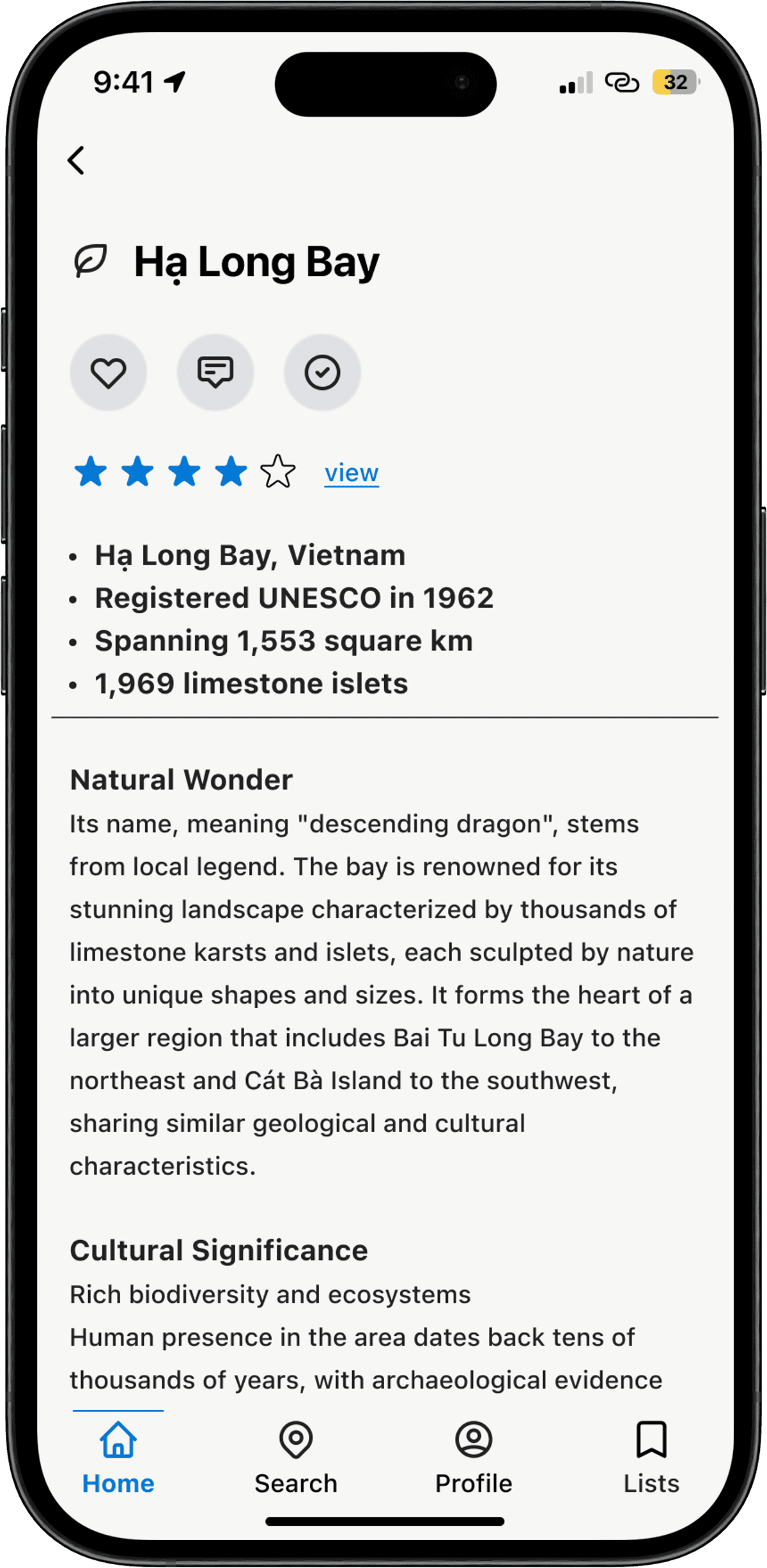
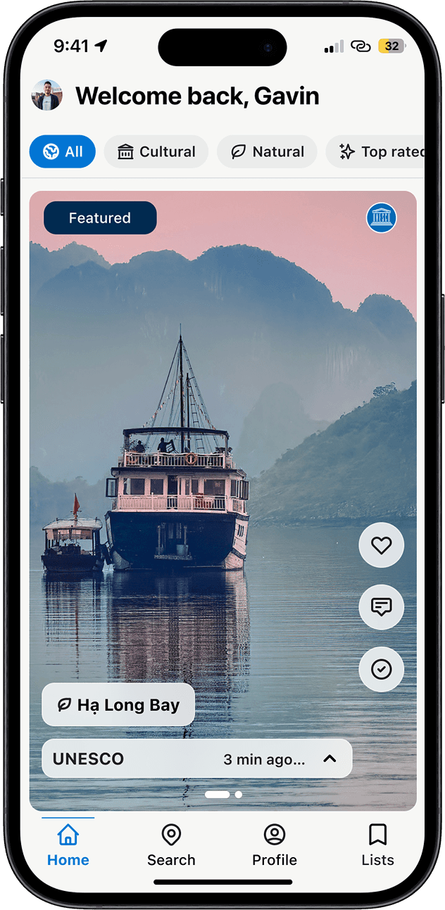
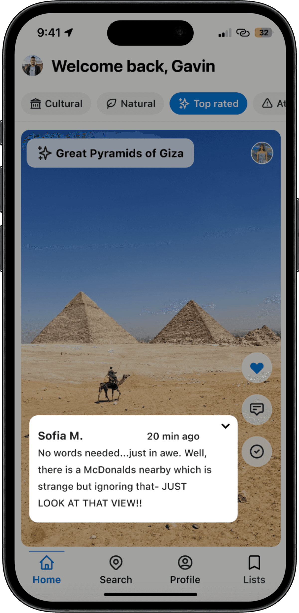
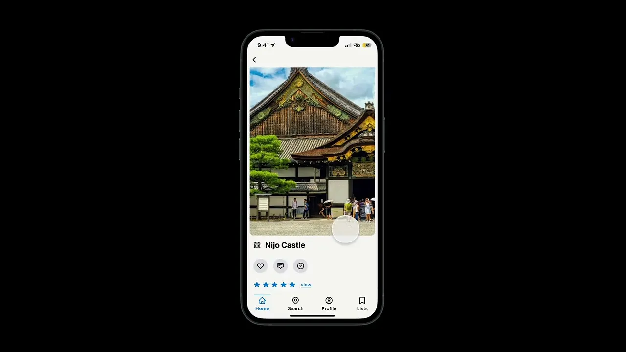
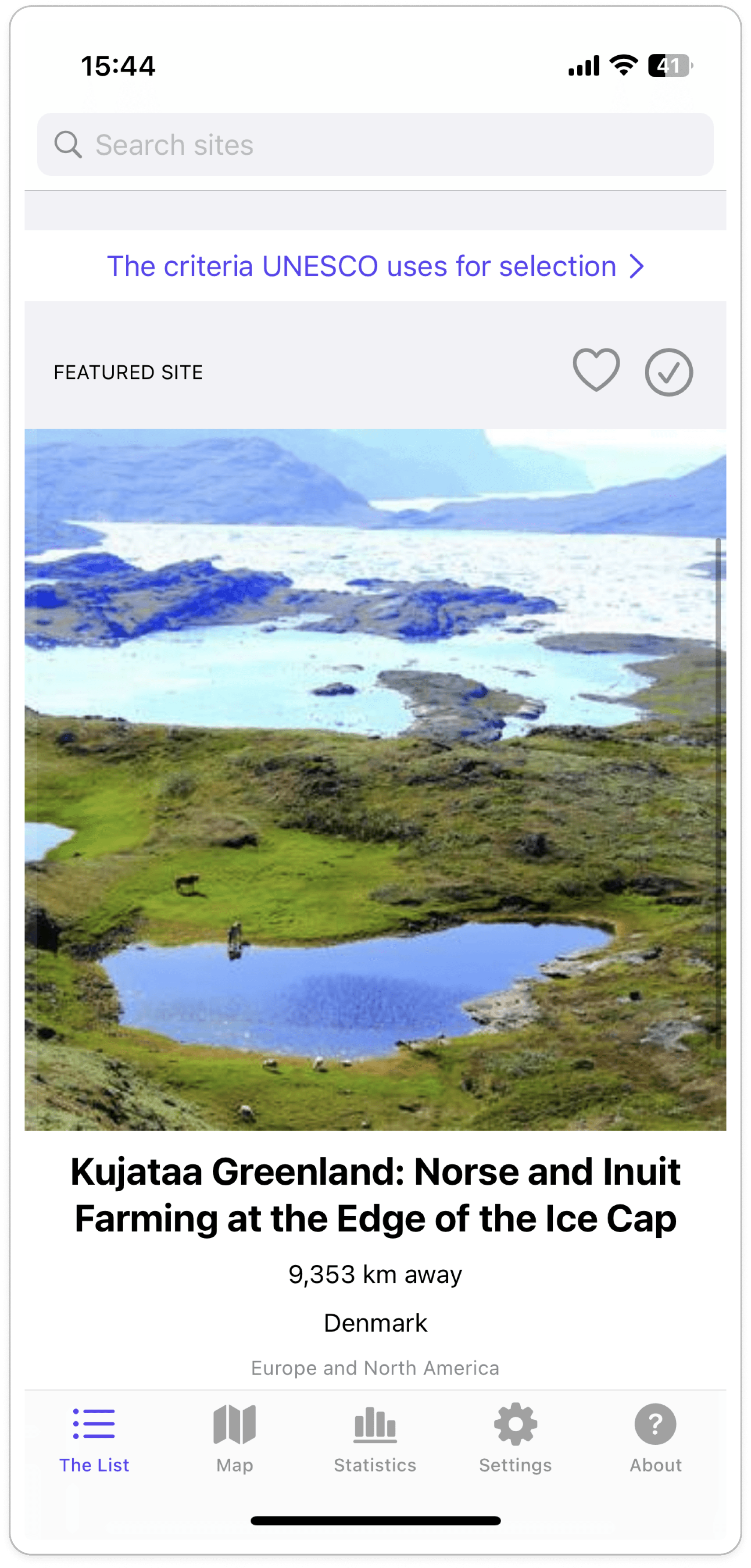
Home feed:
The weekly featured UNESCO site doesn't look like an advertisement and users can now interact with it (liking, writing comments, checking off if they've visited, viewing high quality images in the carousel). Site details are organized with scannable text blocks and headers, plus bullet points for key information. There is a stronger feeling of community as users can interact with posts made by other members. Filtering sites is easier to see and simplified with pills at the top of the screen.
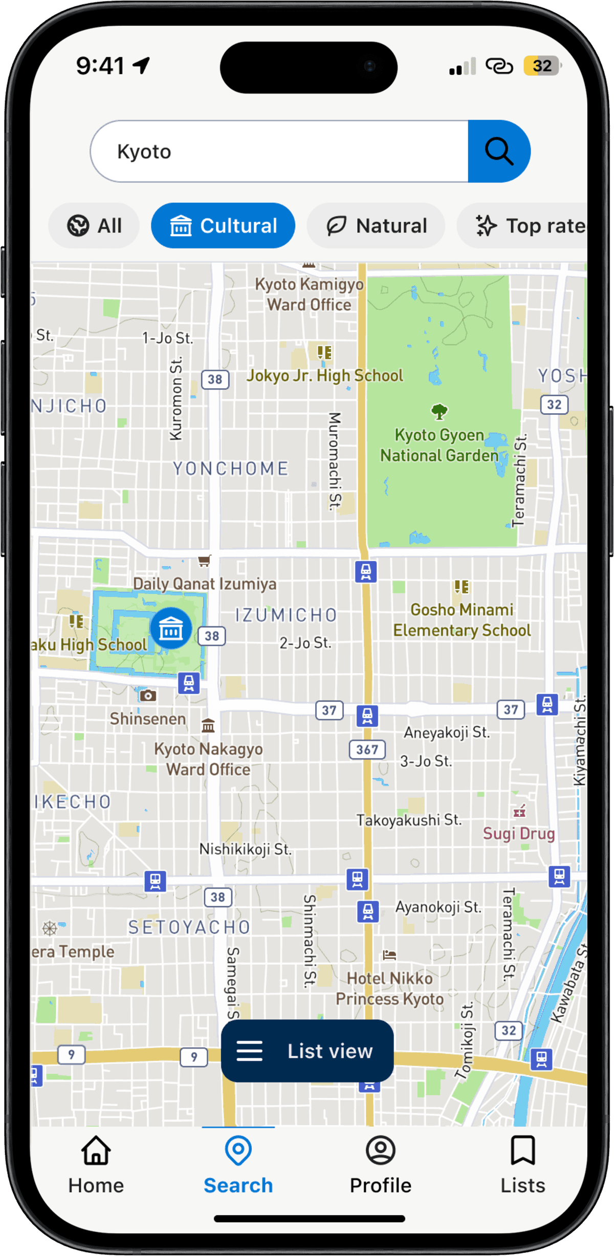
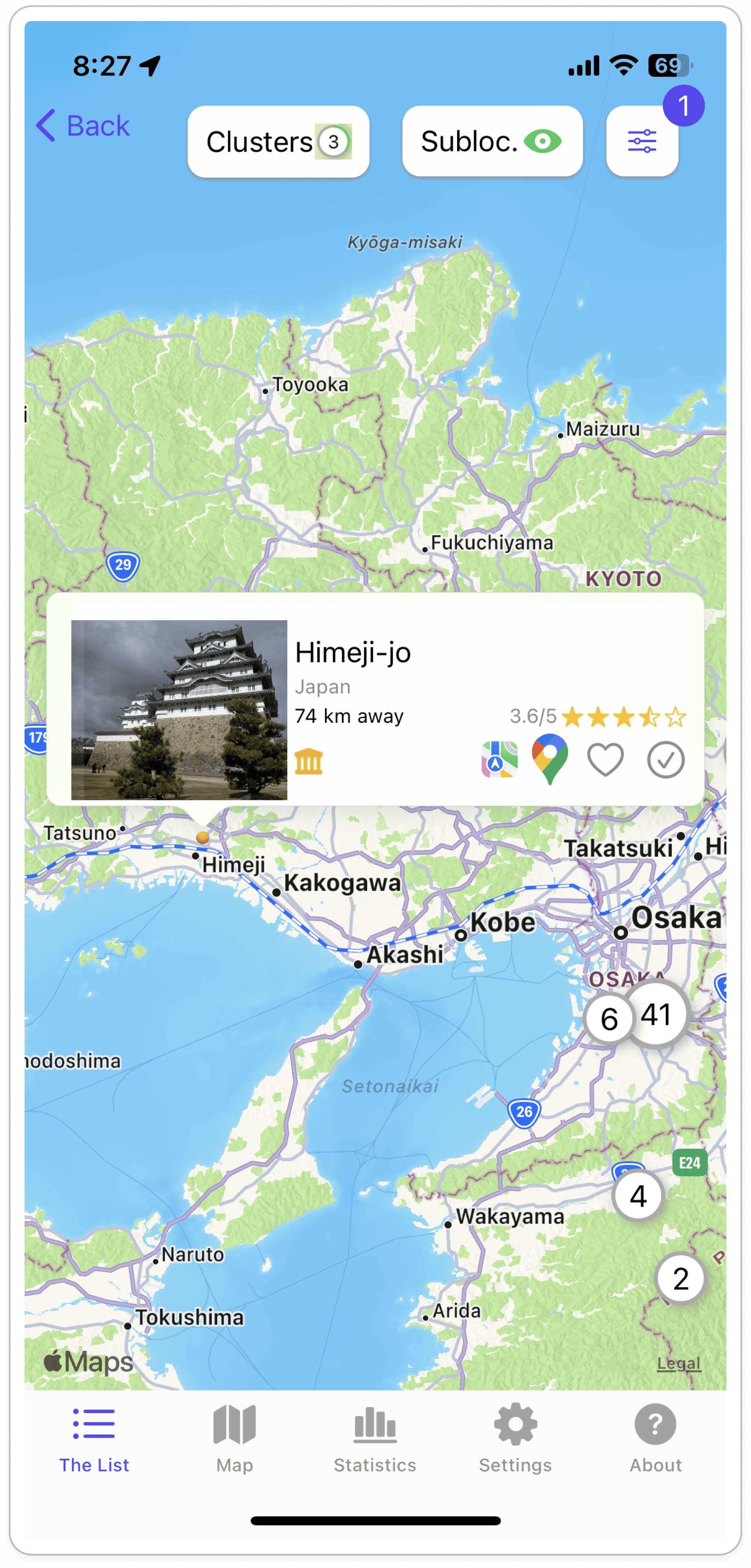
Clear Map:
Solved navigation confusion by aligning map icons directly with category filter icons and offering dual view modes, reducing cognitive load and giving the users a choice. The list view provides users with a snippet of information and image of the site to capture their attention before they dive into reading a lengthier article about the location.


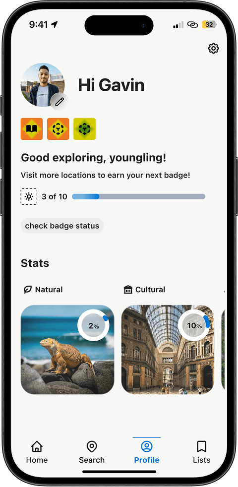
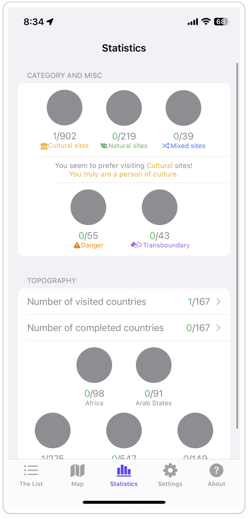
Profile Stats & Lists:
Introduced a gamified/achievement experience for visual progress of tracking visited locations through badges and circular stats, which I took from an earlier iteration. This addresses potential user drop-off by transforming passive browsing and learning into an engaging journey that encourages continued exploration of world heritage sites in real life. Users are also given control for customizing their own lists.
User Testing Insights
"This would really help with my trip planning!"
users want a personal image gallery related to each UNESCO site to share and look back
40%
of users want a photo gallery
users want to share their stats and badges with others on other social media platforms
20%
of users wanted a way to share their achievements
users wanted to be able to upload and view video content of the various locations to learn and see more
20%
of users wanted video content
users shared their delight in seeing their stats grow for sites visited and receving badges
100%
of users were motivated by tracking & badges
users asked if the app was ready to download- they were ready to connect with a community
80%
of users wanted to download the app ASAP
“I love this! I have a couple of trips planned this summer and I don’t know too much about what there is to see. This would help.”
60%
of users saw the immediate value
Learnings
Stakeholder validation & real world constraints
Present my design to two UNESCO employees who showed interest in the project but also shared concerns over funding. They did share my idea at a conference in August, but unfortunately it did not bear fruit. However, it was a good experience and knowing that individuals within the organization showed intrigue was wonderful.
Learned that there is a group of users who would benefit from and actively use an app if it became a reality
Considered the financial and time restrictions that would possibly appear if this project were handed off to a dev. team