Filling a Need for UNESCO World Heritage Enthusiasts
Filling a Need for UNESCO World Heritage Enthusiasts


Roles
UX/UI
Year
2024
Skills
Research
Wireframing
Prototyping
Device
Mobile
As a travel, culture, and history lover
I enjoy planning trips and learning about “hidden gems”. However, I sadly noticed that there is absolutely no official app for discovering, learning about and tracking world heritage sites!
Well, what about Google Maps?
Sure, maps does exist but it’s not easy to only pinpoint UNESCO sites on the map. Plus, maps doesn’t offer an educational aspect to the sites and sometimes UNESCO offices appear in maps as well- all leading to frustration.
Ok, but there’s the official UNESCO website. Can’t you use that?
That is true. But the website appears to function more as a Wikipedia page and the information is not well organized. Sometimes, world heritage sites are even lumped together in one listing and I feel that I’m missing out on specific information. Photos on the website are of low quality and there’s no way to engage with the material.
Can you try third-party apps? ⭐
I did manage to find third-party apps on the store. Yet, these are not official and many of them seem to be projects that still do not completely address the needs for an enthusiast or someone who is getting into world heritage sites. It is nice to see that people are trying to create something though. I finally downloaded one of the apps, gave it a go, and immediately saw that there could be improvements made. This is what lead to my own UENSCO app redesign project.
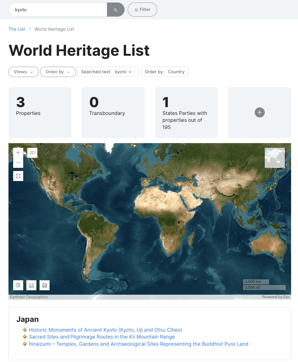
UNESCO’s official website
UNESCO’s official website

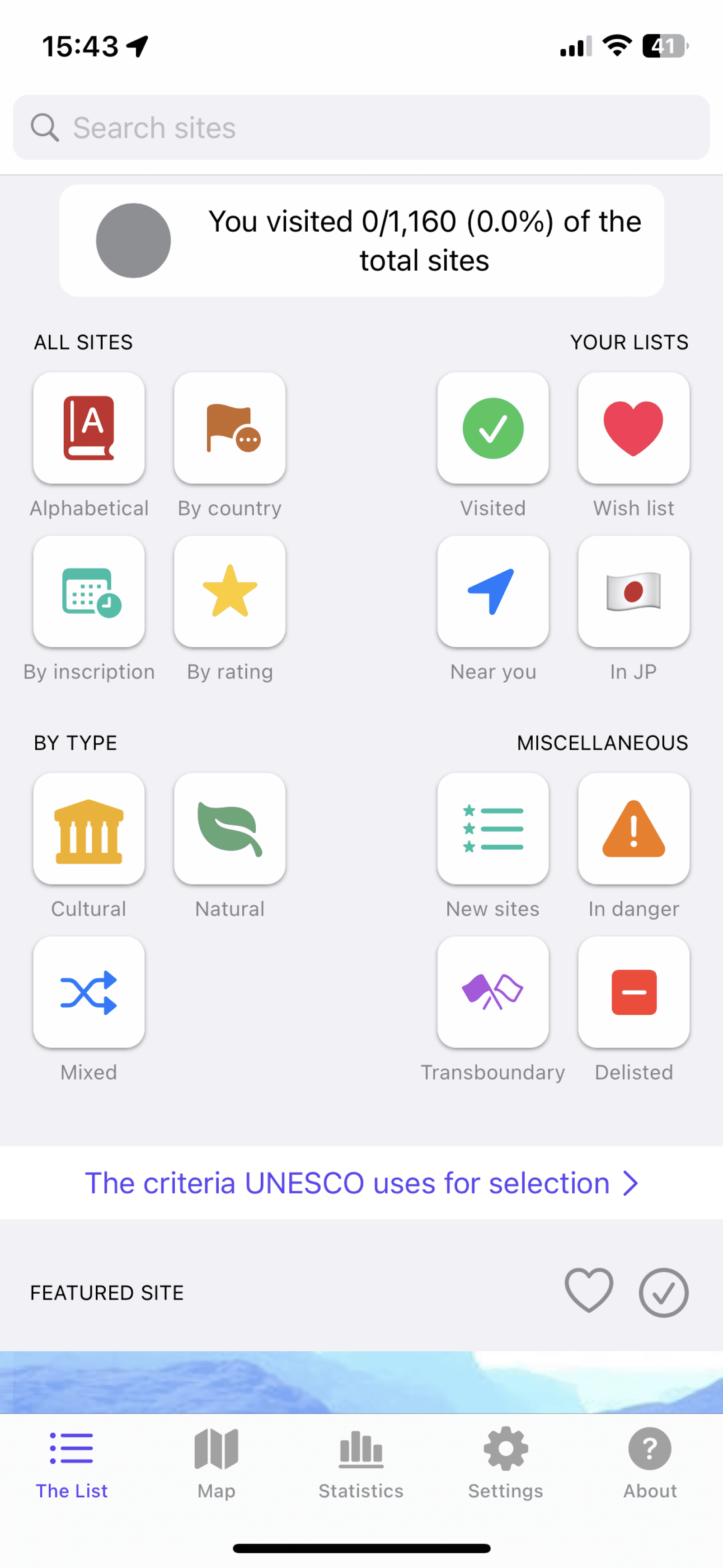
Multitude of pain points with the third party app 😖
Multitude of pain points with the third party app 😖
As I inspected and reviewed the third party app, I ran into many issues. While it was wonderful that someone took the time to create this, I couldn’t help but feel disappointed. Below you can find all the pain points I noted as I analyzed my walk through of the app.
As I inspected and reviewed the third party app, I ran into many issues. While it was wonderful that someone took the time to create this, I couldn’t help but feel disappointed. Below you can find all the pain points I noted as I analyzed my walk through of the app.
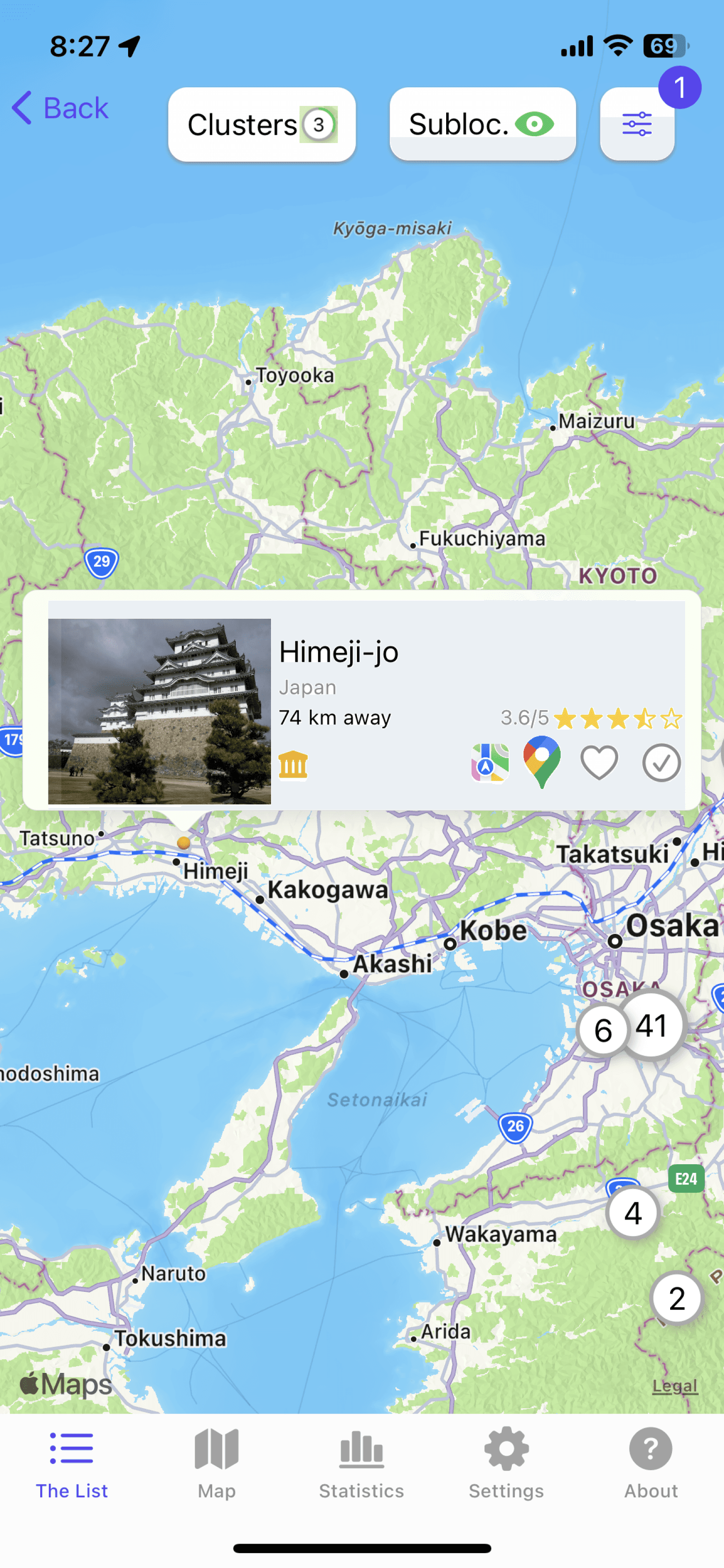
Looks like an advertisement
Unsure why “The List” is the first
screen the user is taken to
Some bottom navigation pages not necessary; could be hidden in a hamburger menu
1
2
3
4
5
6
1
Outdated look
Too many colors leading to cognitive overload,
weak visual hierarchy, no ‘brand’ identity,
clutter, as well as not meeting accessibility
guidelines
Statistics button here and on the bottom
navigation; unnecessary
2
3
4
5
6
1
2
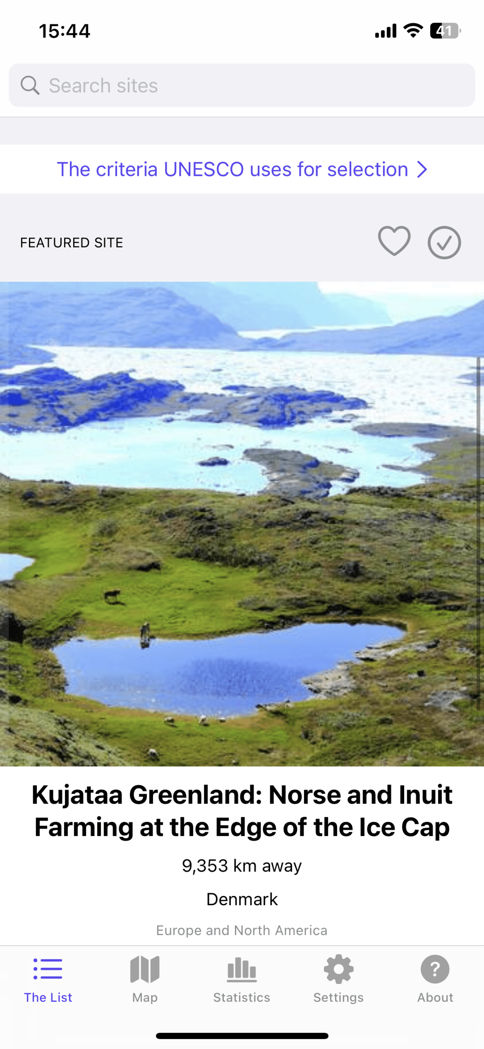
Looks like an advertisement
Low quality images; can’t scroll to see more
1
2
1
2
1
2
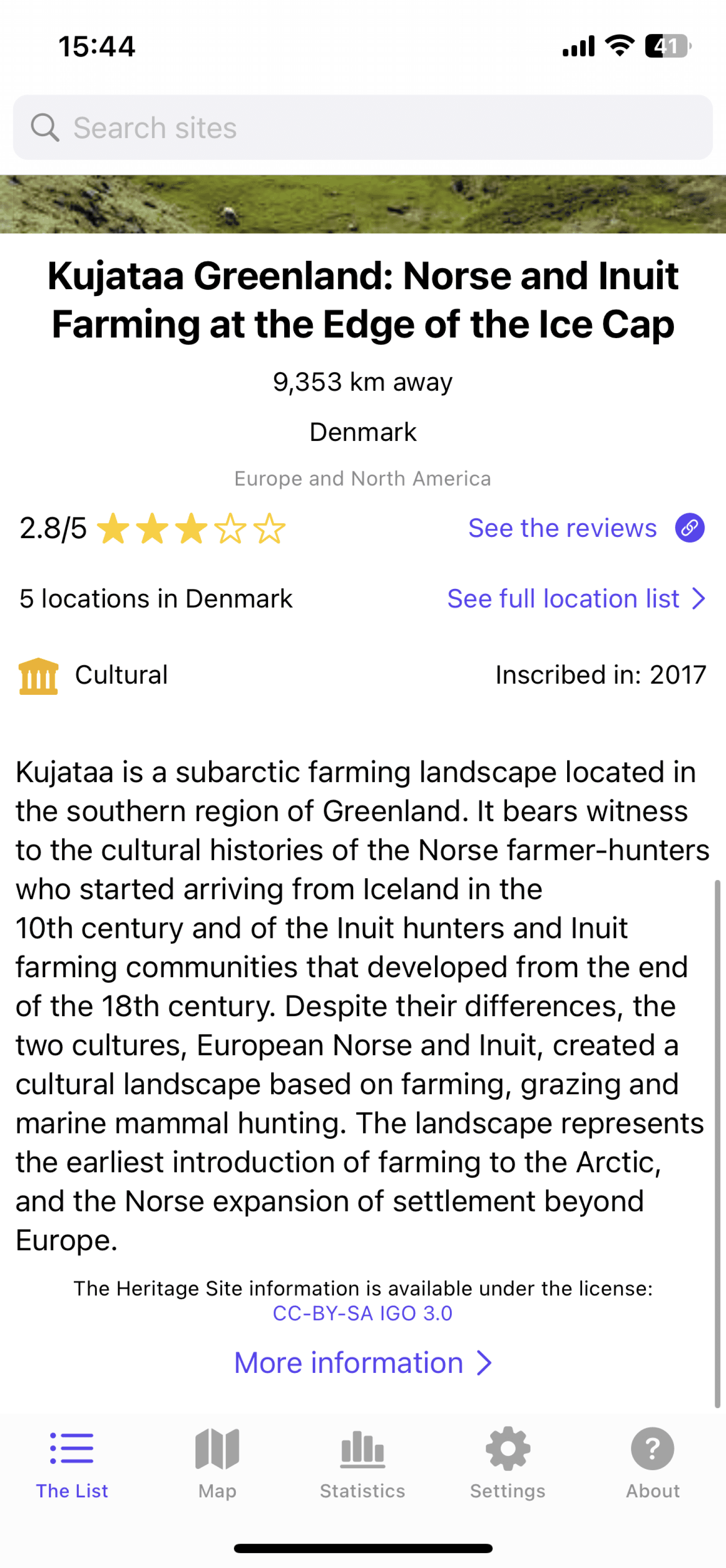
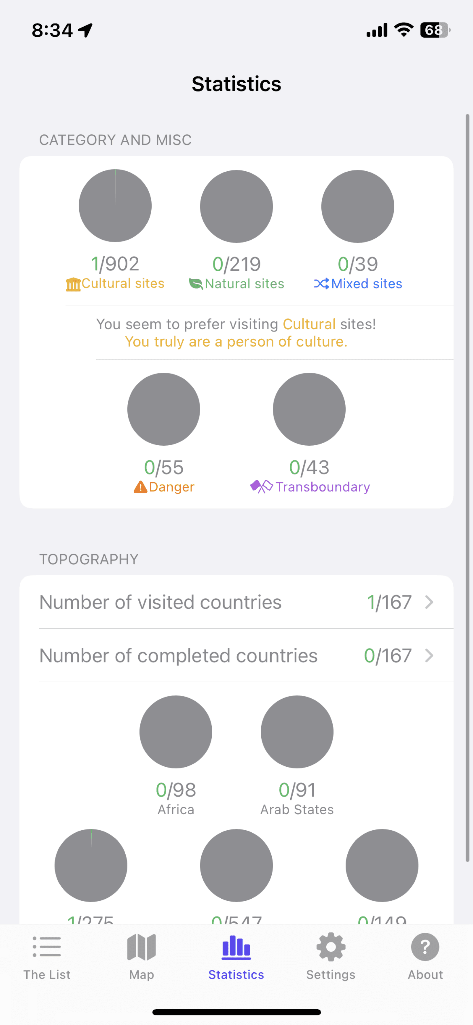
Hierarchy of typography needs improvement
Information and visual overload on the user
2
1
Map icons and numbers are confusing; numbers don’t match up with the exact amount of sites in that specific location;
inconsistent icon sizes and styles
Confusing language
1
2
1
2
2
1
Unfilled circles making the user believe that the page hasn’t fully loaded; also feels overwhelming because there are many areas that need to be ‘completed’ and that can make users feel unmotivated and uncertain
Unsure what of what to do on this page; too many points of interaction
1
2
3
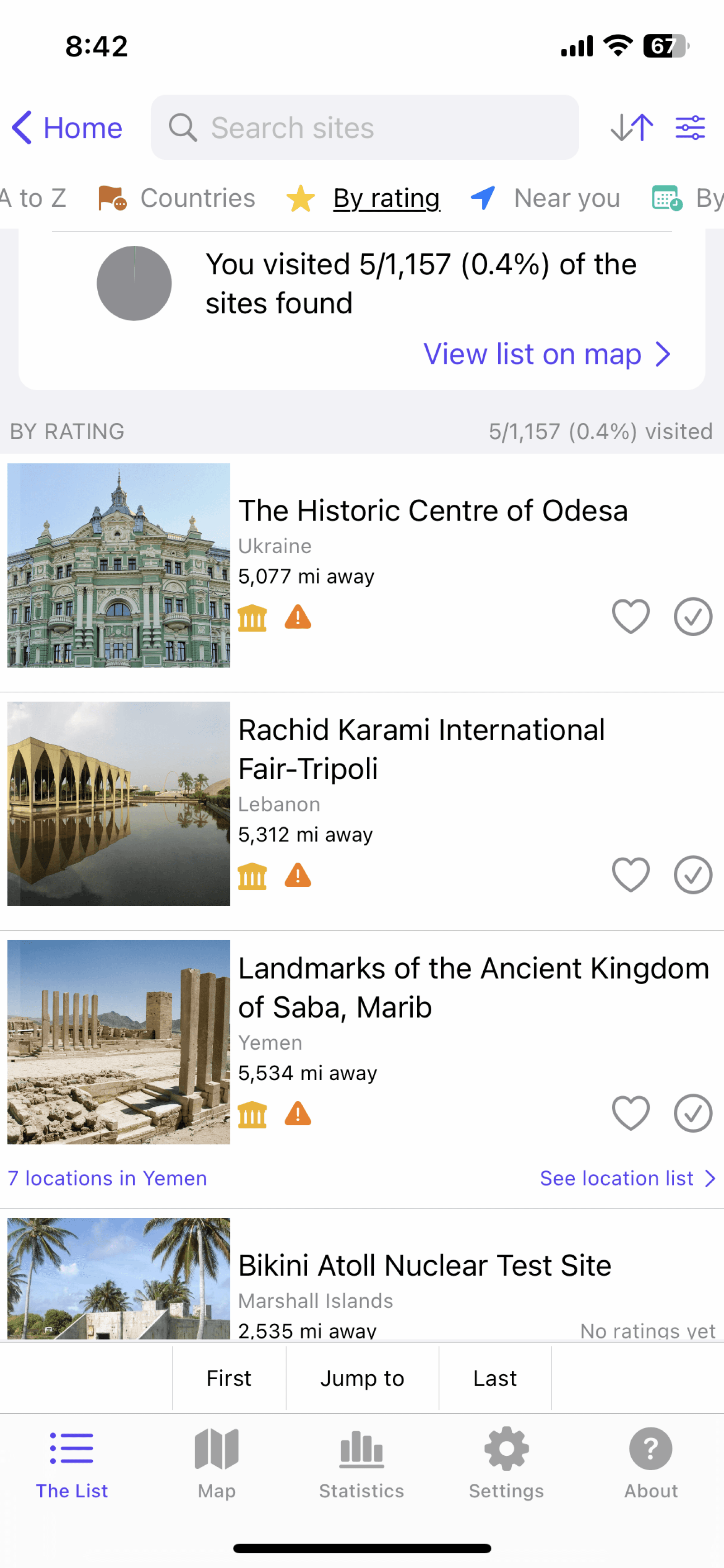
Filtering is here but also at the top right;
Cluttered header, difficult to navigate
Location list vs regular listings?
Generally, the buttons blend into the background; primary and secondary button could stand out more
1
2
3
1
2
3
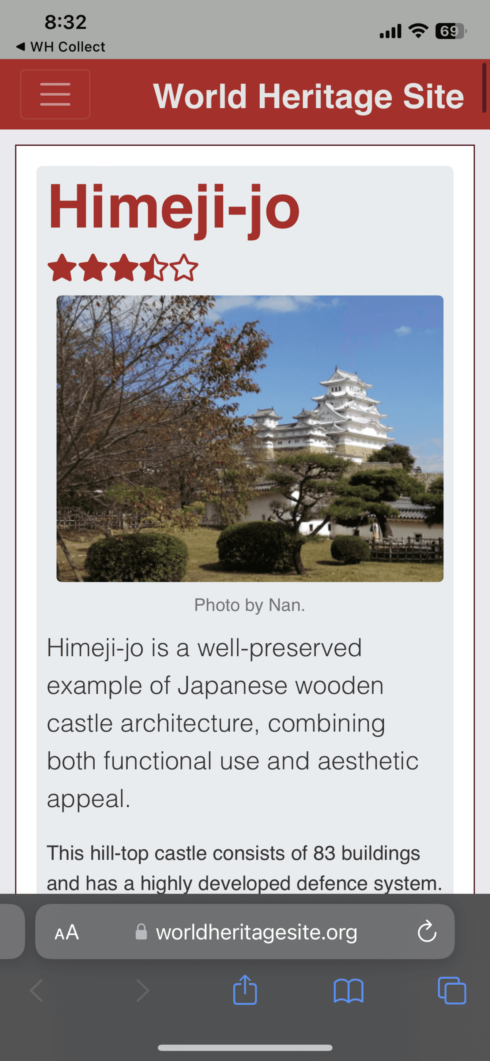
Clicking on “see reviews” or read more takes me to a page outside of the app on every single heritage site
Overwhelming amount of information
Being taken outside of the app frequently makes the user feel that the app is untrustworthy
1
2
3
Too many colors leading to cognitive overload,
weak visual hierarchy, no ‘brand’ identity,
clutter, as well as not meeting accessibility
guidelines
Too many colors leading to cognitive overload,
weak visual hierarchy, no ‘brand’ identity,
clutter, as well as not meeting accessibility
guidelines
Looks like an advertisement
Looks like an advertisement
Outdated look
Outdated look
Statistics button here and on the bottom
navigation; unnecessary
Statistics button here and on the bottom
navigation; unnecessary
Unsure why “The List” is the first
screen the user is taken to
Unsure why “The List” is the first
screen the user is taken to
Some bottom navigation pages not necessary; could be hidden in a hamburger menu
Some bottom navigation pages not necessary; could be hidden in a hamburger menu
Hierarchy of typography needs improvement
Hierarchy of typography needs improvement
Information and visual overload on the user
Information and visual overload on the user
Unfilled circles making the user believe that the page hasn’t fully loaded; also feels overwhelming because there are many areas that need to be ‘completed’ and that can make users feel unmotivated and uncertain
Unsure what of what to do on this page; too many points of interaction
Unsure what of what to do on this page; too many points of interaction
Filtering is here but also at the top right;
Cluttered header, difficult to navigate
Filtering is here but also at the top right;
Cluttered header, difficult to navigate
Location list vs regular listings?
Location list vs regular listings?
Generally, the buttons blend into the background; primary and secondary button could stand out more
Generally, the buttons blend into the background; primary and secondary button could stand out more
Clicking on “see reviews” or read more takes me to a page outside of the app on every single heritage site
Clicking on “see reviews” or read more takes me to a page outside of the app on every single heritage site
Overwhelming amount of information
Overwhelming amount of information
Being taken outside of the app frequently makes the user feel that the app is untrustworthy
Being taken outside of the app frequently makes the user feel that the app is untrustworthy
Map icons and numbers are confusing; numbers don’t match up with the exact amount of sites in that specific location;
inconsistent icon sizes and styles
Map icons and numbers are confusing; numbers don’t match up with the exact amount of sites in that specific location;
inconsistent icon sizes and styles
Confusing language
Confusing language
Looks like an advertisement
Low quality images; can’t scroll to see more
Low quality images; can’t scroll to see more
How do I redesign the app to make the discovery experience enjoyable, engaging, and stress-free?
How do I redesign the app to make the discovery experience enjoyable, engaging, and stress-free?
Final redesign (video)
Final redesign (video)
How did I get here?
How did I get here?
• Competitor (5) analysis
• Low-fidelity wireframes
• Feedback from those in the industry
• Competitor (5) analysis
• Low-fidelity wireframes
• Feedback from those in the industry
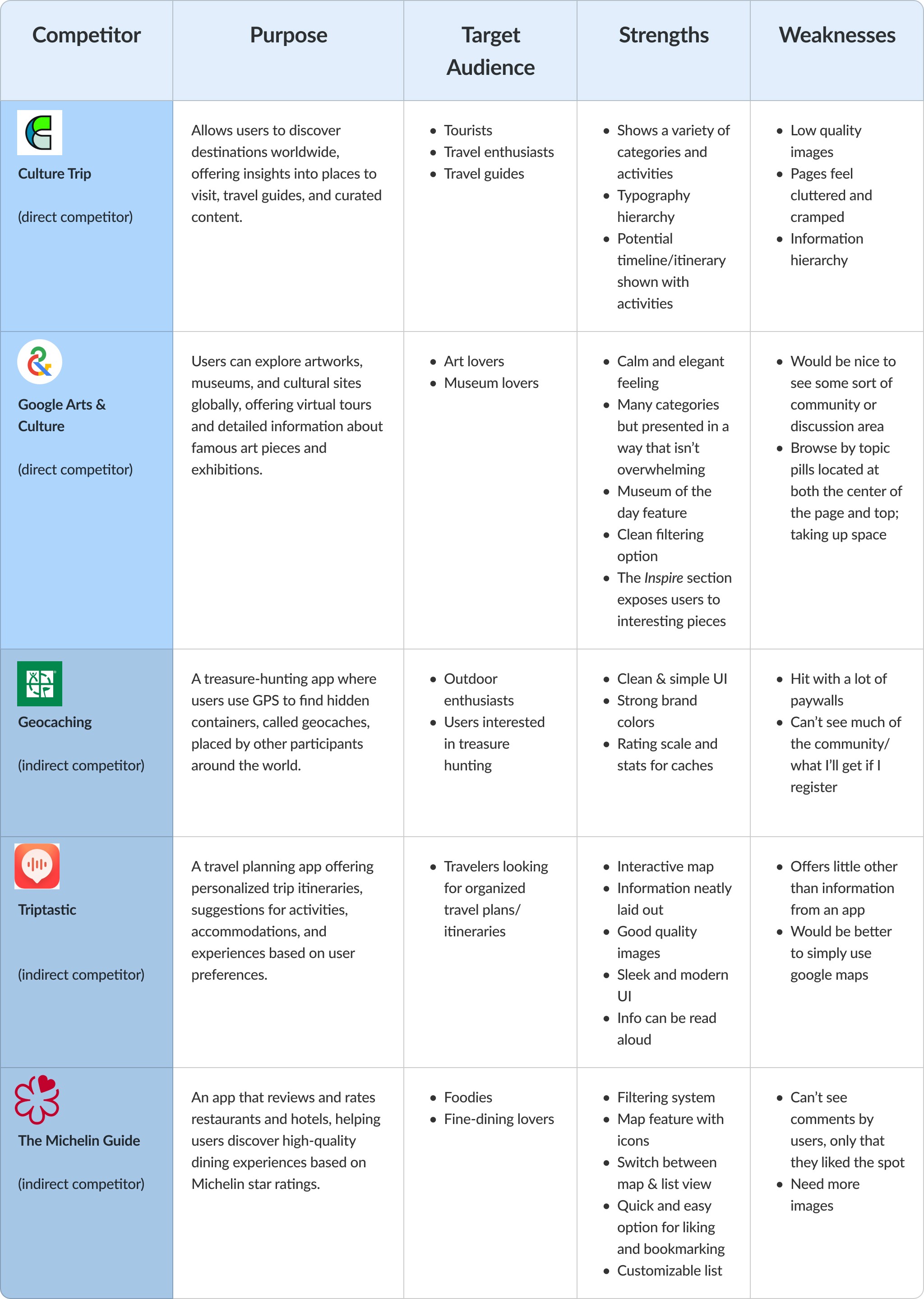
Competitor analysis on five different apps/websites
Competitor analysis on five different apps/websites
The analysis really reinforced the idea that the redesign needed to be intuitive to use, informative, display photos and reviews easily, and bring a community element to the platform. The final redesign was heavily inspired by my findings from the analysis
The analysis really reinforced the idea that the redesign needed to be intuitive to use, informative, display photos and reviews easily, and bring a community element to the platform. The final redesign was heavily inspired by my findings from the analysis
Lots of considerations to be made = simplify the creation process
Lots of considerations to be made = simplify the creation process
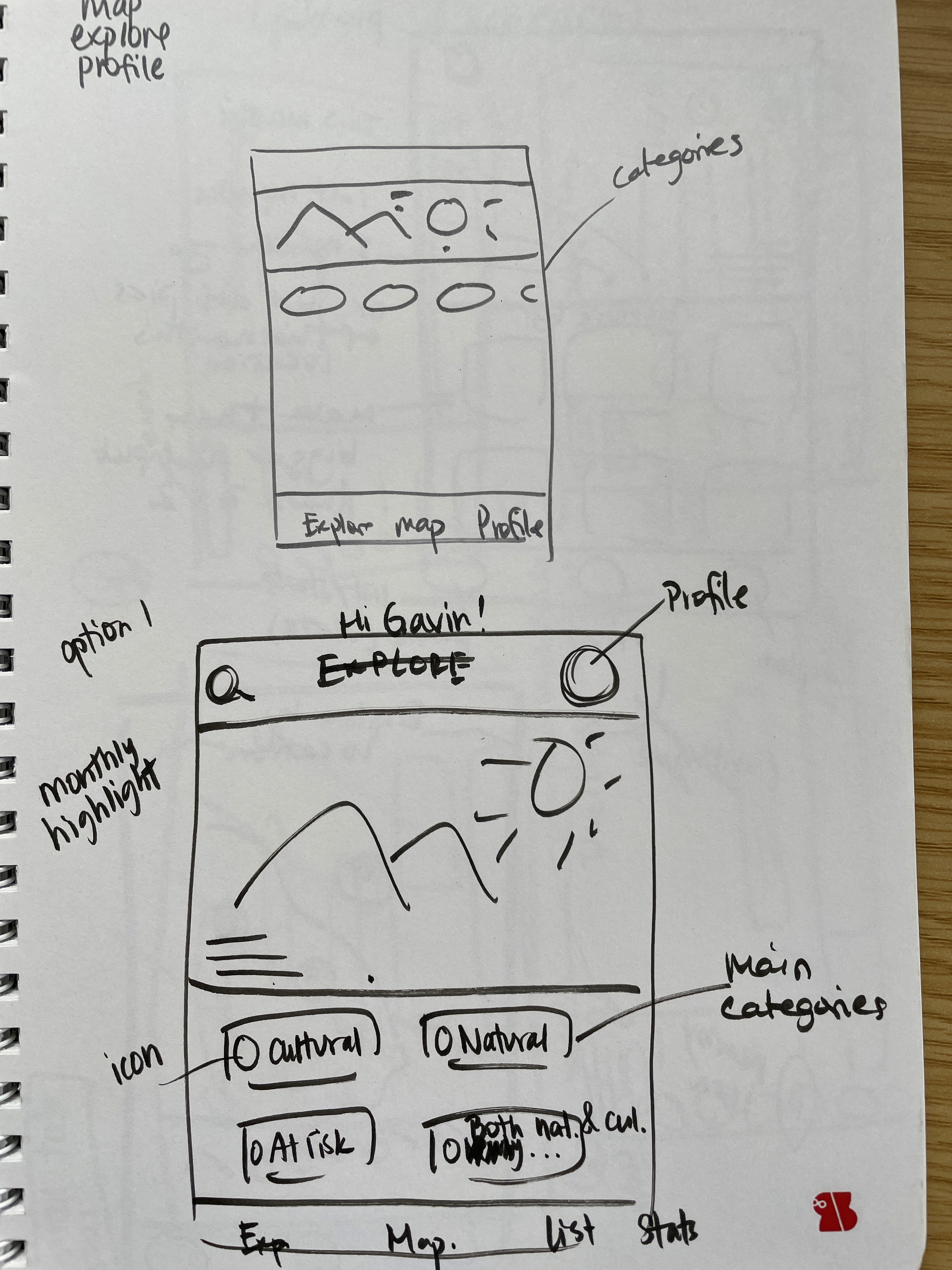
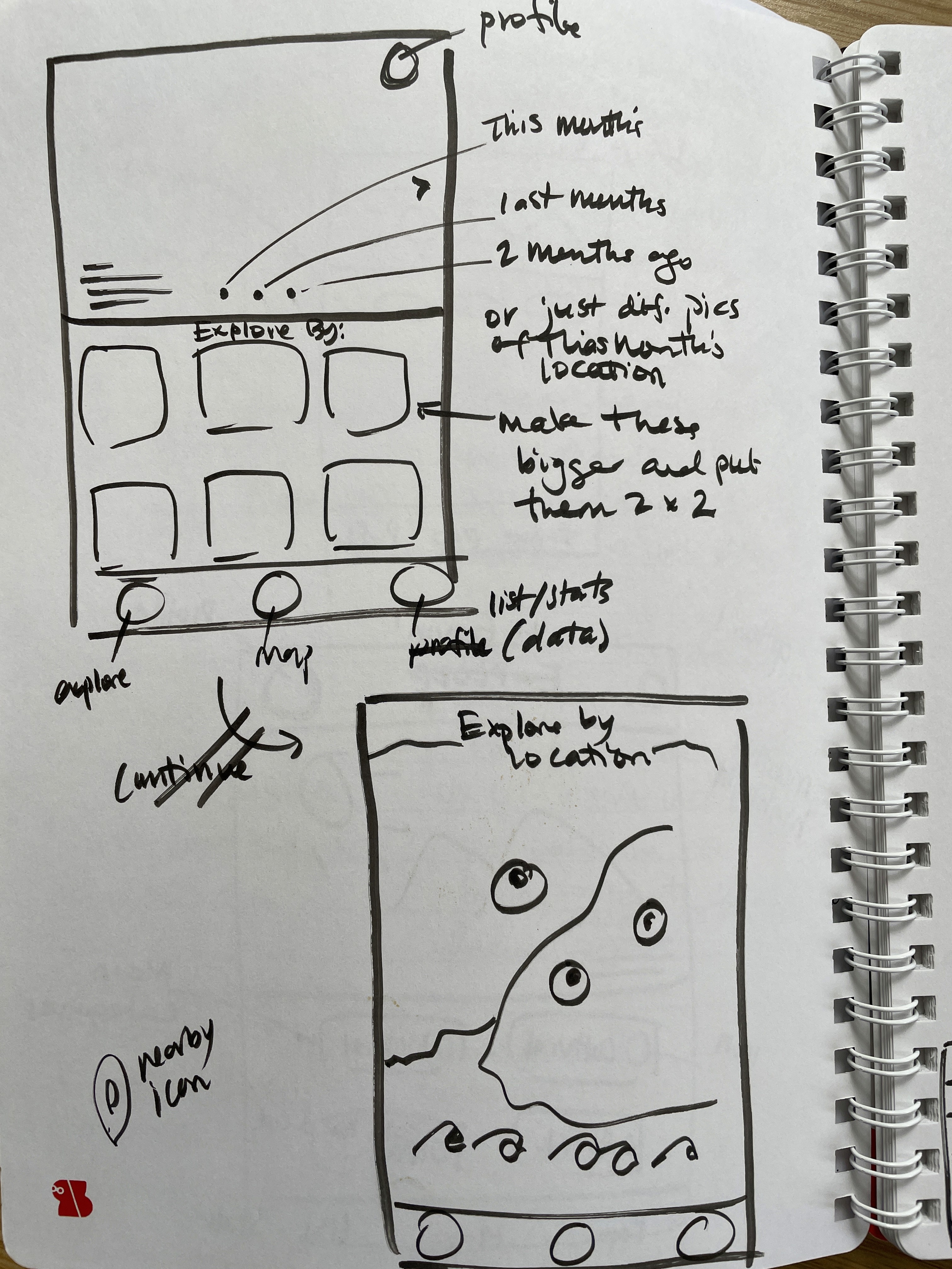
Looking through the competitor analysis and getting inspiration from other apps made me realize that perhaps I was biting off a bit more than I could chew. So, to streamline things, I knew I needed to break down the redesign into achievable sections. I started my low fidelity wireframing first with pen and paper and then moved into Figma.
Looking through the competitor analysis and getting inspiration from other apps made me realize that perhaps I was biting off a bit more than I could chew. So, to streamline things, I knew I needed to break down the redesign into achievable sections. I started my low fidelity wireframing first with pen and paper and then moved into Figma.
My attempt at displaying stats in a creative and fun way…
I had a few ideas for how to present a user’s visiting history statistics and played around with it on Figma. However, I came to the realization that some of these designs would probably present issues for a future development team or take too much time and resources in a real life situation. Below are two of the designs I came up with but ended up abandoning.
Top: Circles for heritage site categories that grow each time a user checks off if they’ve visited the site.
Bottom: Growing circles concept plus two bigger circle lists that show where the user wants to visit and the total number of sites visited.
My attempt at displaying stats in a creative and fun way…
I had a few ideas for how to present a user’s visiting history statistics and played around with it on Figma. However, I came to the realization that some of these designs would probably present issues for a future development team or take too much time and resources in a real life situation. Below are two of the designs I came up with but ended up abandoning.
Left: Circles for heritage site categories that grow each time a user checks off if they’ve visited the site.
Right: Growing circles concept plus two bigger circle lists that show where the user wants to visit and the total number of sites visited.
9:41
Your stats!
Cultural
Natural
Mixed
5 out of 1,199
9:41
Your lists
Your stats
want to visit
25
visited
10
Cultural
Natural
Mixed
5 out of 1,199
9:41
Your stats!
Cultural
Natural
Mixed
5 out of 1,199
9:41
Your lists
Your stats
want to visit
25
visited
10
Cultural
Natural
Mixed
5 out of 1,199
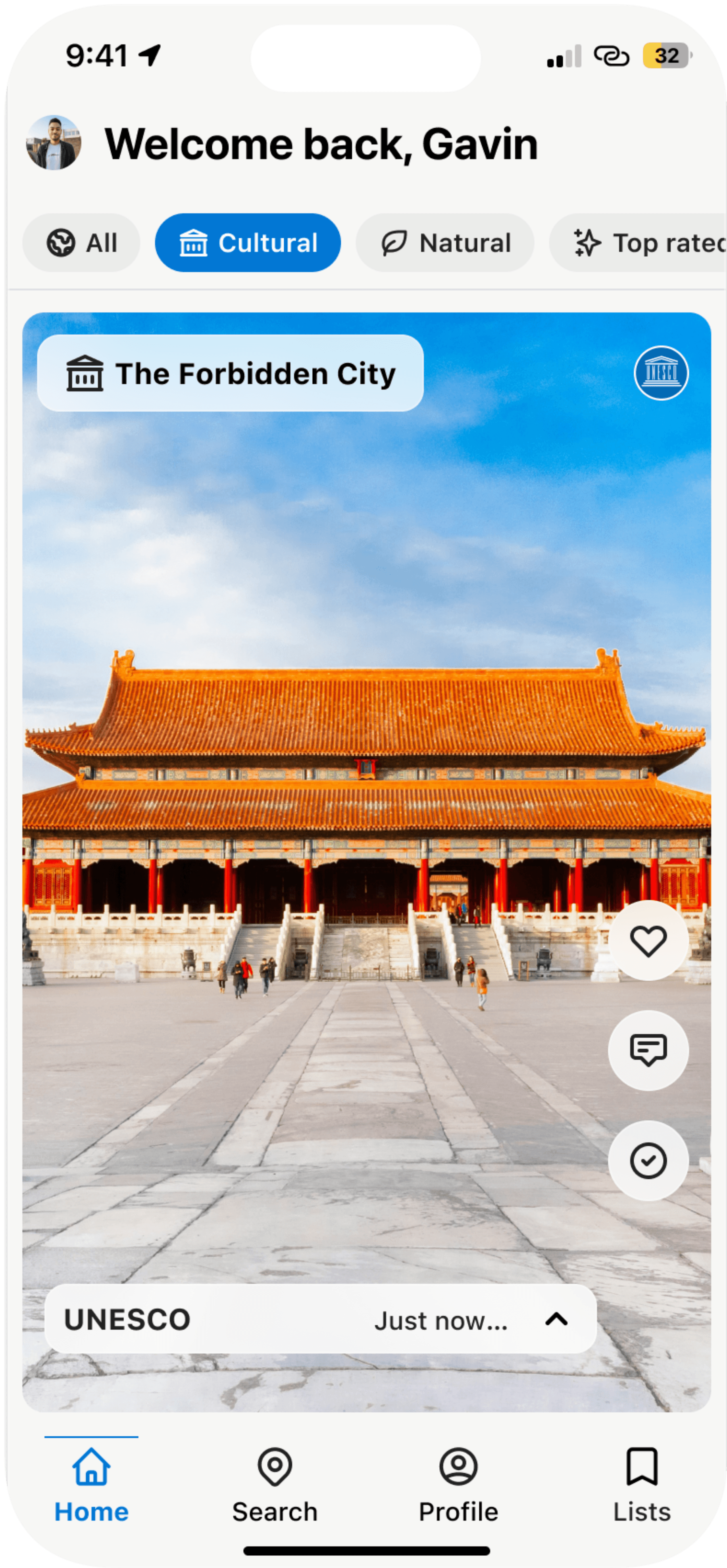
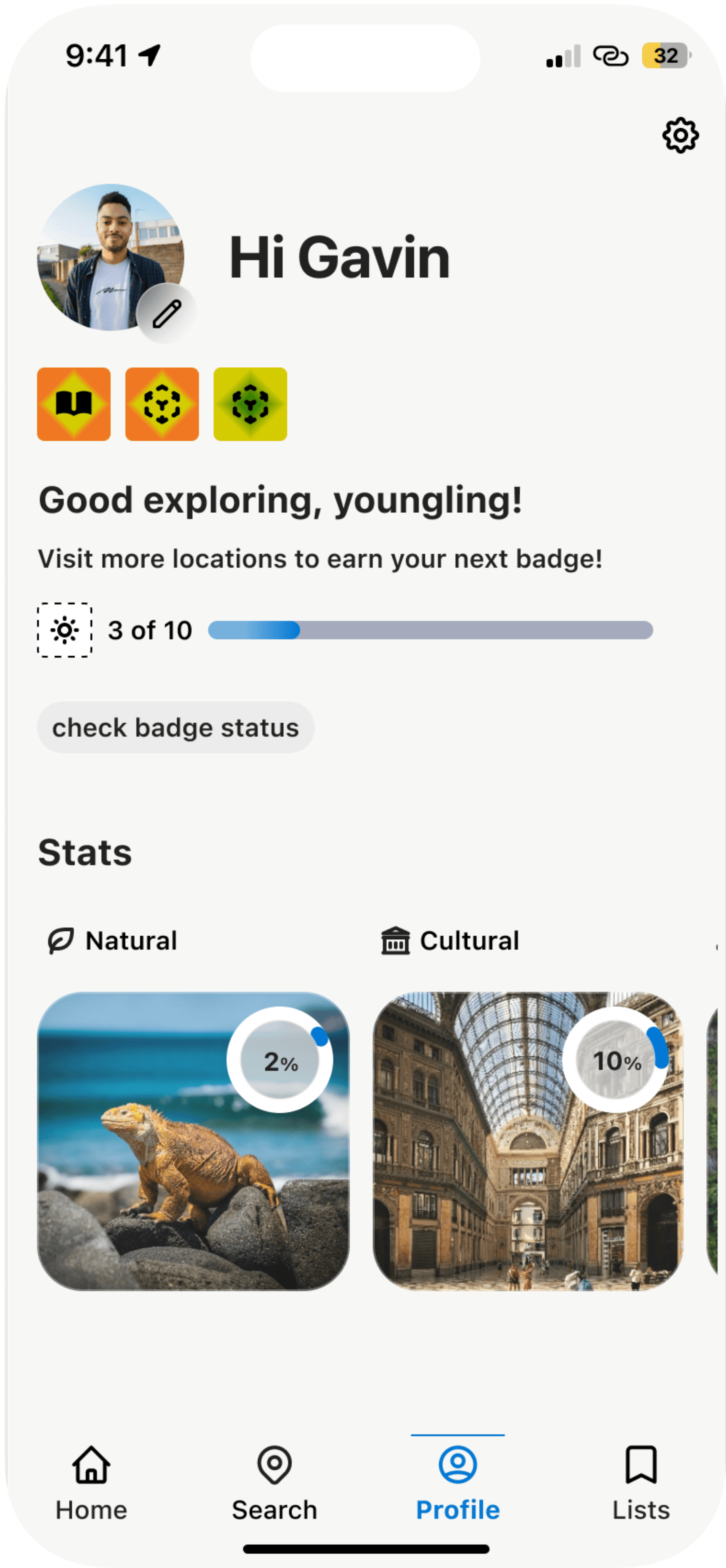
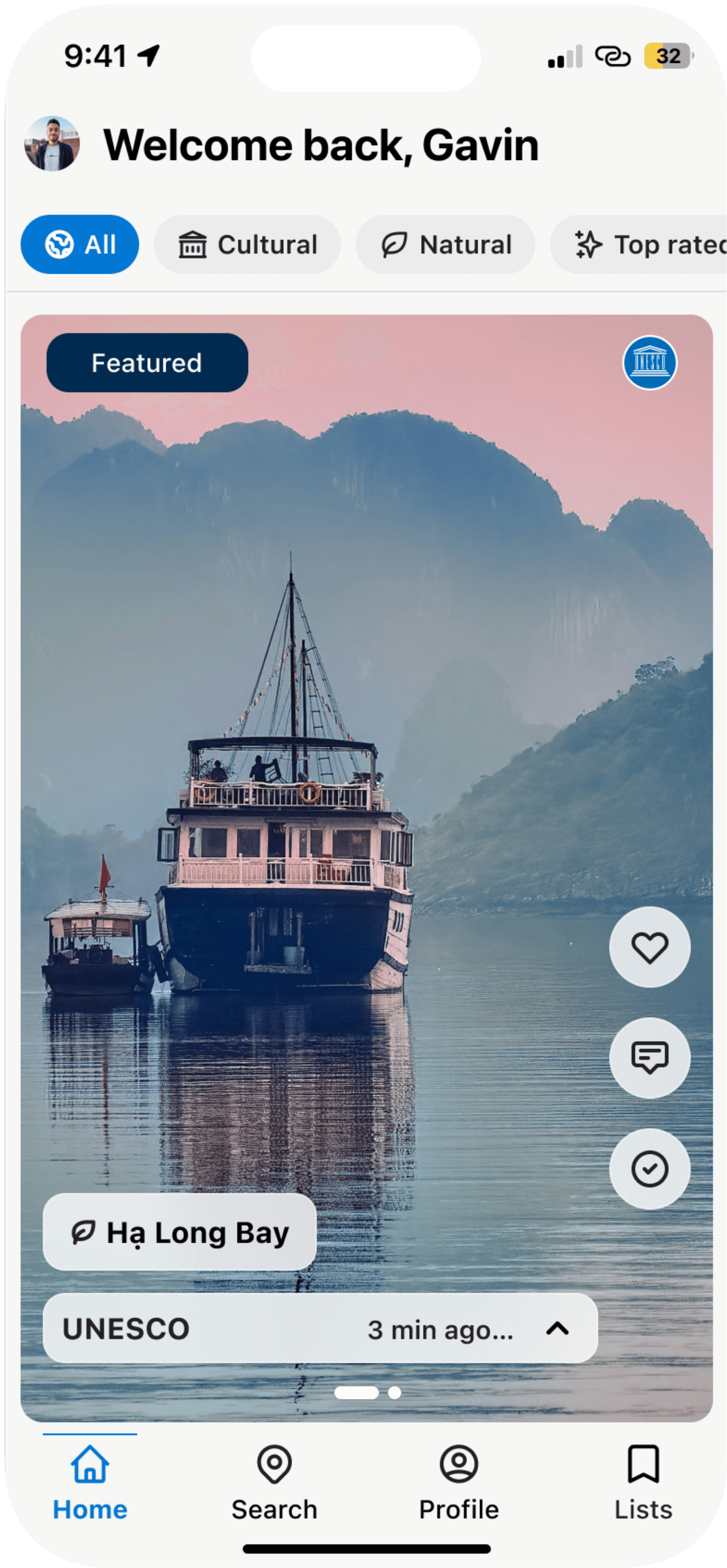
Researching + lots of wireframes + feedback from industry professionals = FINAL 💪🏼
Researching + lots of wireframes + feedback from industry professionals = FINAL 💪🏼
1
2
3
4
5
Quickly add to wish list, comment or mark a site as visited
Personalization with the user’s name
“Featured” highlights lesser known sites to curious users
High quality images - some in a carousel view
Improved bottom navigation -decluttered and only included necessary pages
3
4
5
1
2
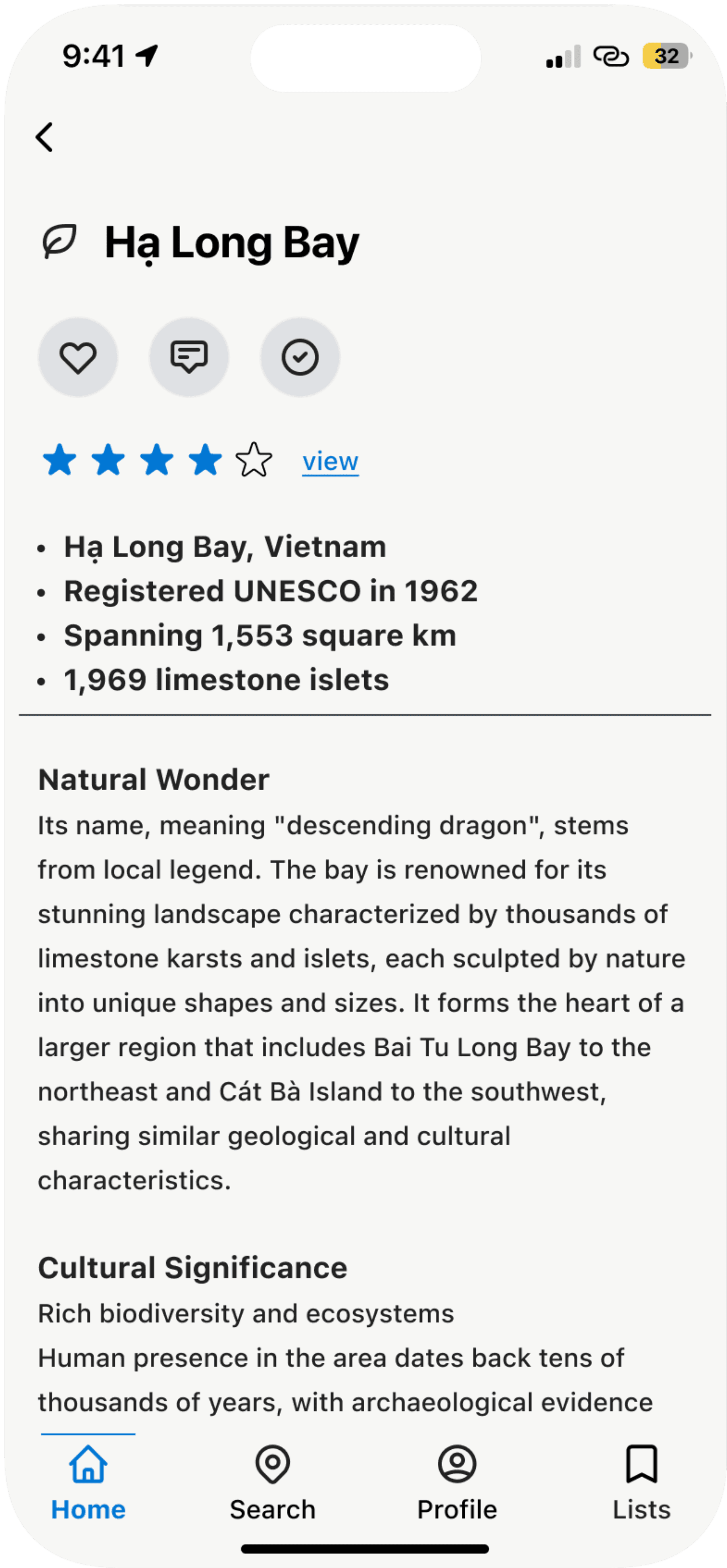
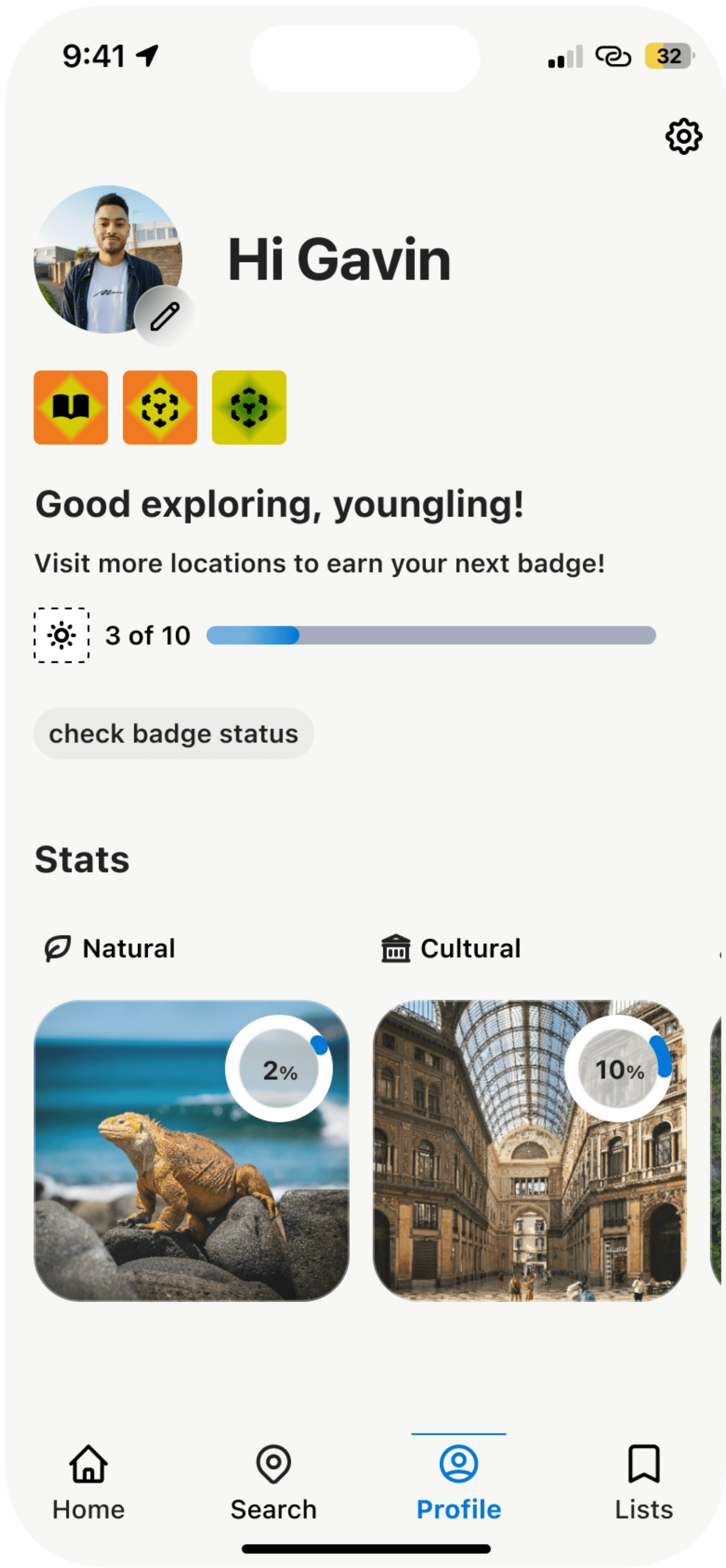
Clearer information hierarchy
Large chunks of text is separated and now scannable
Quickly view community comments about the site
Cleaned up the category icons and made them less visual invasive
3
4
1
2
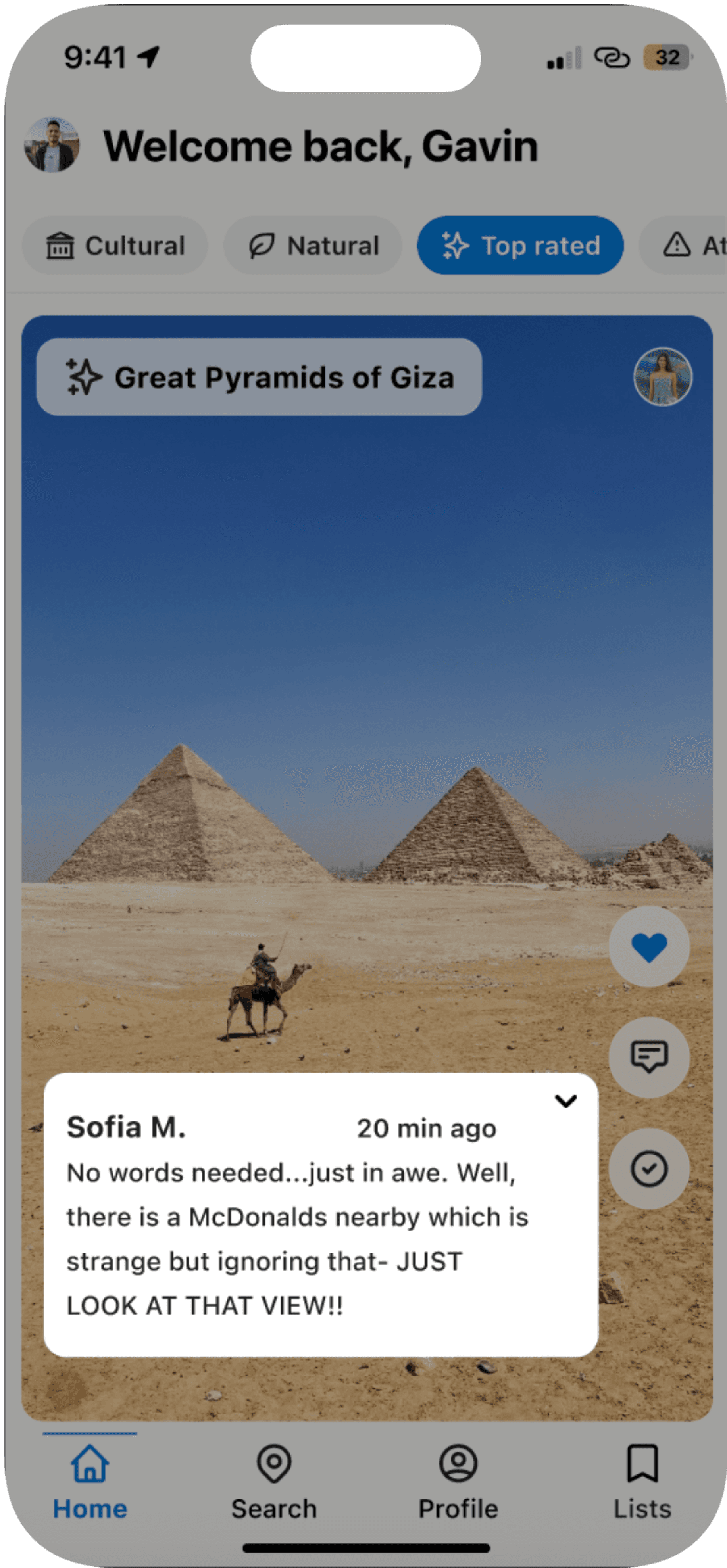
Quickly view what other users say in their posts about the world heritage site
Users can filter content on their home page with the category pills
1
2
1
2
3
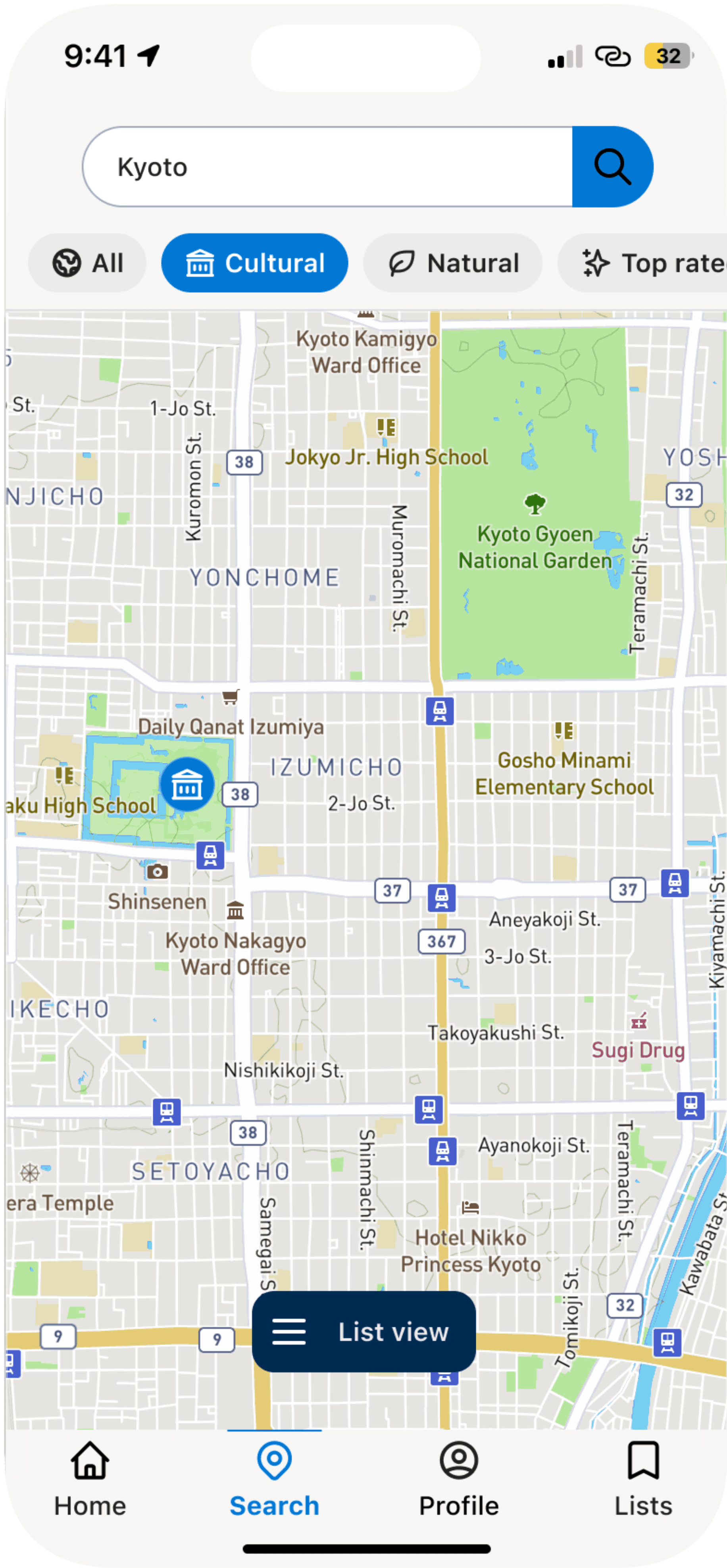
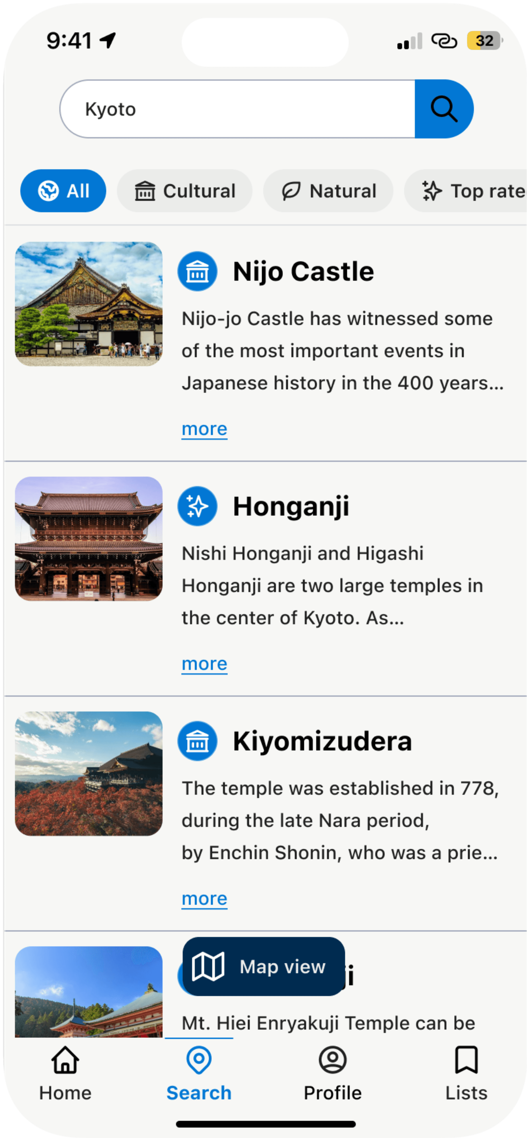
Filter search results by category
Tappable icons on map directly relate to category icons - no more confusion
Switch between map and list view
3
1
2
1
User is provided a snippet of information on the site to draw their attention
1
1
2
3
Easy to understand progress bar
Statistics now stand out visually and the amount left to fill is better understood
Gamified learning experience to encourage exploration and world heritage site tracking
3
1
2
Expanded badge information provides details about how well the user is progressing and how much they have left to discover and visit
Friendly language that feels personable
1
2
1
2
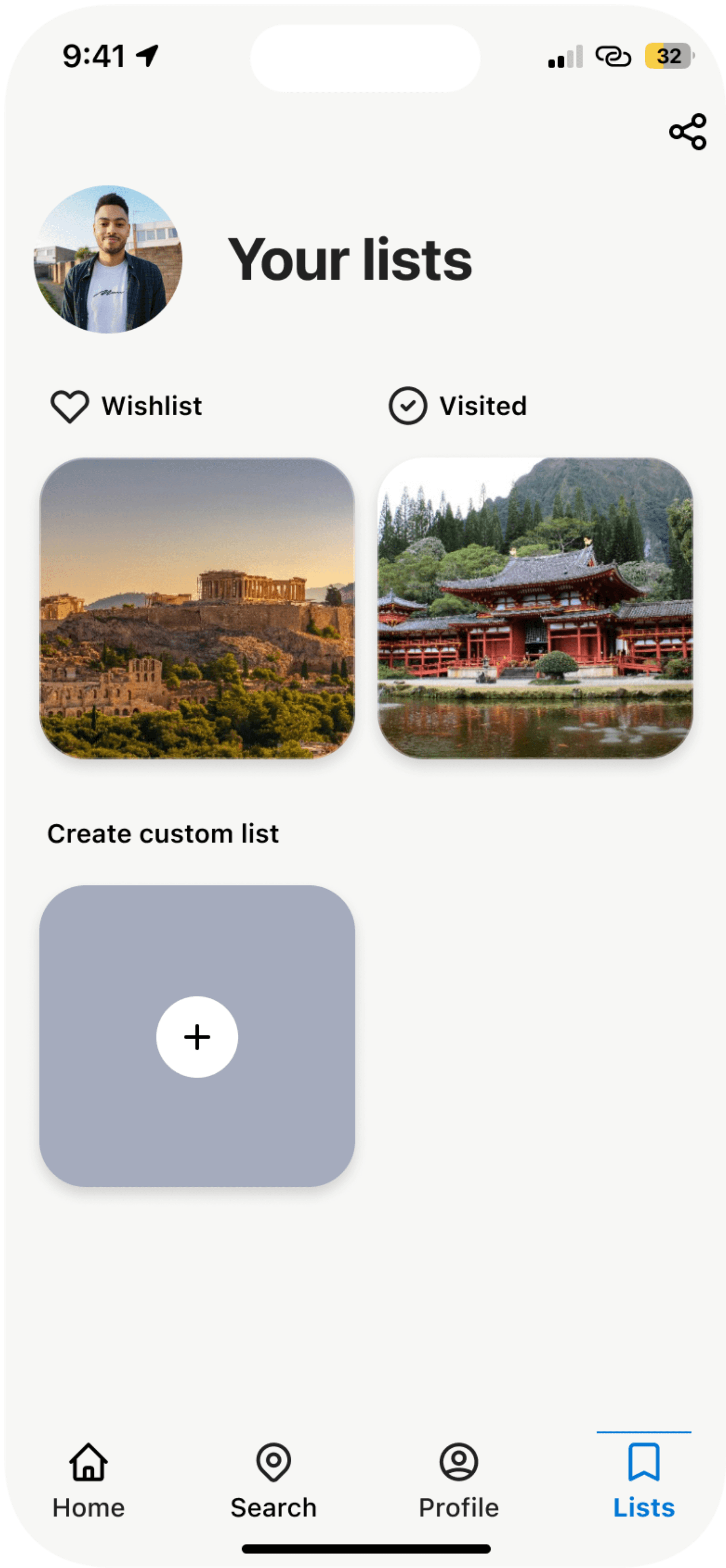
User can quickly access their wishlist, visited list as well as customize additional lists
Simple and easy to understand layout
1
2
2
1
Filter each list by UNESCO category
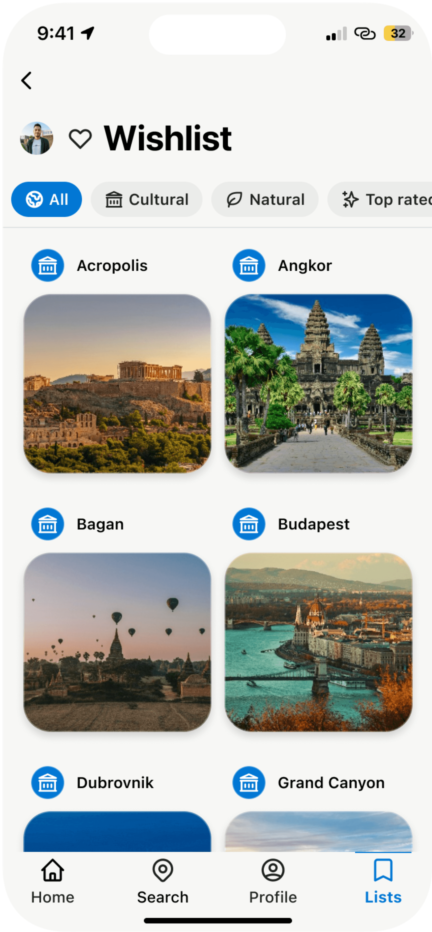
Tappable high quality, beautiful images mark each site in the list
1
2
Quickly add to wish list, comment or mark a site as visited
Personalization with the user’s name
“Featured” highlights lesser known sites to curious users
High quality images - some in a carousel view
Improved bottom navigation -decluttered and only included necessary pages
Filter search results by category
Tappable icons on map directly relate to category icons - no more confusion
Switch between map and list view
User is provided a snippet of information on the site to draw their attention
User can quickly access their wishlist, visited list as well as customize additional lists
Simple and easy to understand layout
Filter each list by UNESCO category
Tappable high quality, beautiful images mark each site in the list
Expanded badge information provides details about how well the user is progressing and how much they have left to discover and visit
Friendly language that feels personable
Gamified learning experience to encourage exploration and world heritage site tracking
Easy to understand progress bar
Statistics now stand out visually and the amount left to fill is better understood
Quickly view what other users say in their posts about the world heritage site
Users can filter content on their home page with the category pills
Clearer information hierarchy
Large chunks of text is separated and now scannable
Quickly view community comments about the site
Cleaned up the category icons and made them less visual invasive
“This would really help with my trip planning!” - usability tester
“This would really help with my trip planning!” - usability tester
🤓 4 of 5 users would download
🤓 4 of 5 users would download
I had five people test the prototype to get their initial reactions and thoughts. Four out of five users said that they would be interested in downloading an app like this and using it for their own travel planning.
I had five people test the prototype to get their initial reactions and thoughts. Four out of five users said that they would be interested in downloading an app like this and using it for their own travel planning.
🤓 3 of 5 users see the immediate value
🤓 3 of 5 users see the immediate value
Three users strongly expressed that they would find this app incredibly useful. One said, “I love this!! I have a couple of trips planned this summer and I don’t know too much - yet - about what there is to see. This would help me out.”
Three users strongly expressed that they would find this app incredibly useful. One said, “I love this!! I have a couple of trips planned this summer and I don’t know too much - yet - about what there is to see. This would help me out.”
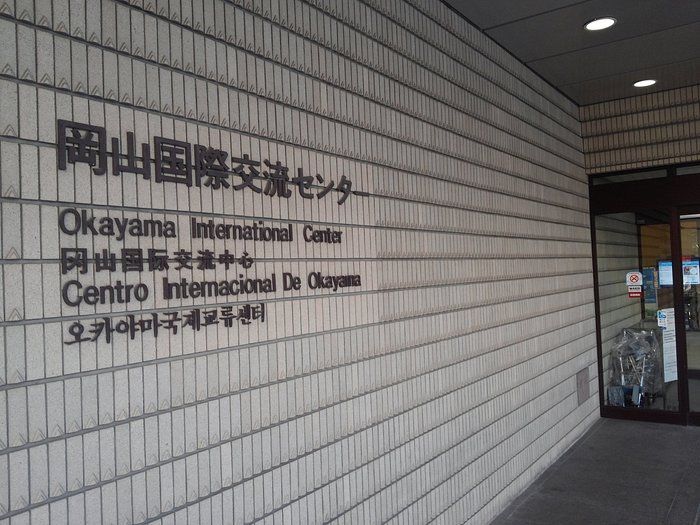
Presenting to UNESCO employees in Japan
Presenting to UNESCO employees in Japan
🎉 From an idea to reality?
🎉 From an idea to reality?
I was lucky enough to have a meeting scheduled with two individuals who work for UNESCO. They listened to my redesign presentation, with interest, and asked me questions such as:
“What is your goal with this project?”
“Who would fund this application?”
“How could we work on this realization of this application in smaller steps?”
In the end, one member decided that he would like to pass on my project to other members who would be attending a large UNESCO event in August of this year.