How do I make the About section inviting, trustworthy, and intriguing?
Before
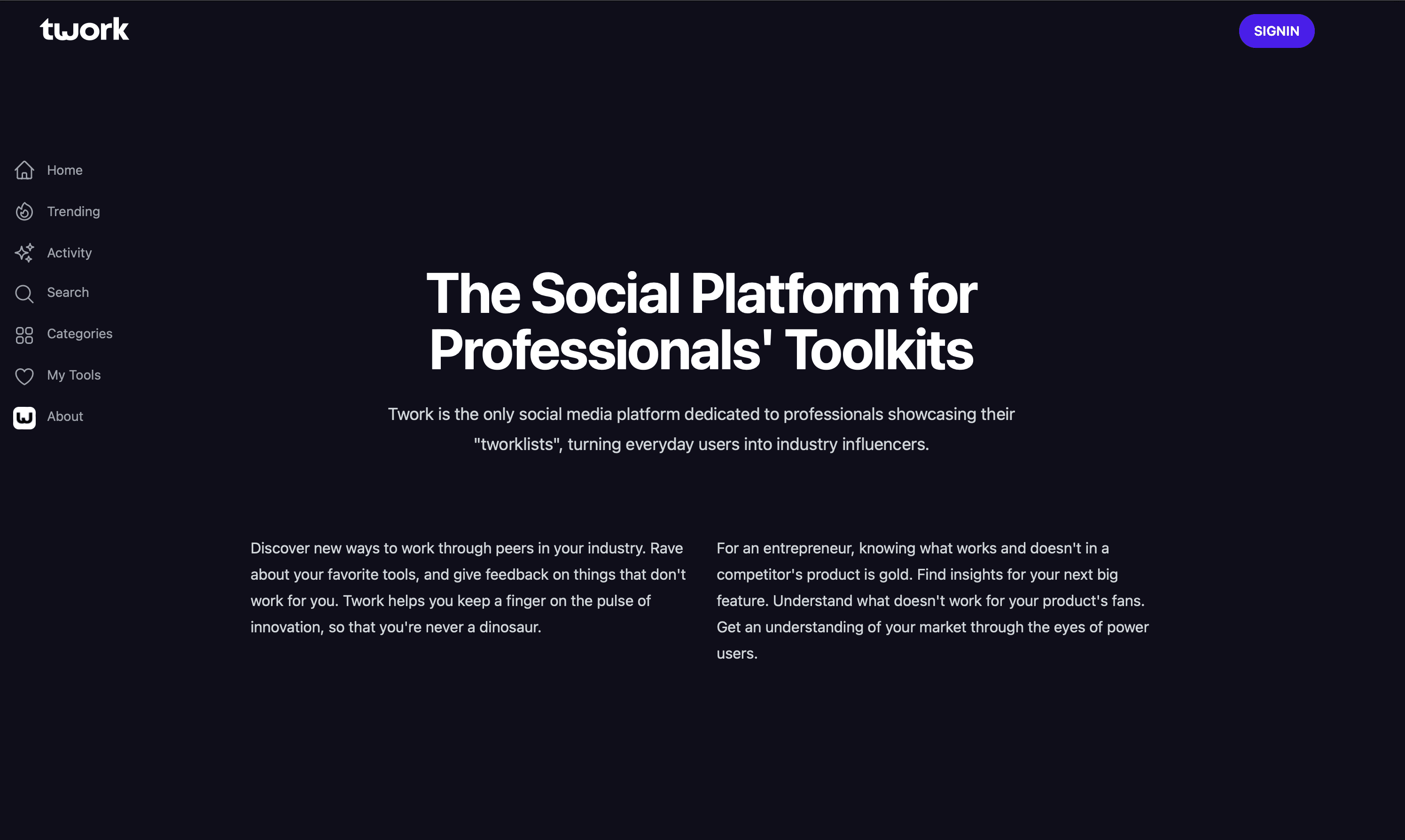
After:
How did I get here?
• Competitor analysis
• Identifying industry patterns
• Co-founder meetings
• Multiple iterations
How do I make the About section inviting, trustworthy, and intriguing?
Before
After:

How did I get here?
• Competitor analysis
• Identifying industry patterns
• Co-founder meetings
• Multiple iterations
How do I make the About section inviting, trustworthy, and intriguing?
Before
After
How did I get to the "After"?
• Competitor analysis
• Identifying industry patterns
• Co-founder meetings
• Multiple iterations
What makes other platforms' About pages work?
While analyzing the competitors gave me some good insights, I wanted to take a closer look at what other non competitor related websites were doing well in their About sections. This process gave me inspiration and broadened my scope of reference because I was able to notice design patterns across various types of websites. Below are some observations I made about CineSync, a platform for cinemas. I also included my observations for Frans Hals Museum’s About page.
What makes other platforms' About pages work?
What makes other platforms' About pages work?
While analyzing the competitors gave me some good insights, I wanted to take a closer look at what other non competitor related websites were doing well in their About sections. This process gave me inspiration and broadened my scope of reference because I was able to notice design patterns across various types of websites. Below are some observations I made about CineSync, a platform for cinemas. I also included my observations for Frans Hals Museum’s About page.
While analyzing the competitors gave me some good insights, I wanted to take a closer look at what other non competitor related websites were doing well in their About sections. This process gave me a lot of inspiration and broadened my scope of reference.
I was able to notice design patterns across various types of websites. Below are some observations I made about CineSync, a platform for cinemas. I also included my observations for Frans Hals Museum’s About page.

Summarizing my findings and observations, I brainstormed what TWORK’s page should include
Summarizing my findings and observations, I brainstormed what TWORK’s page should include

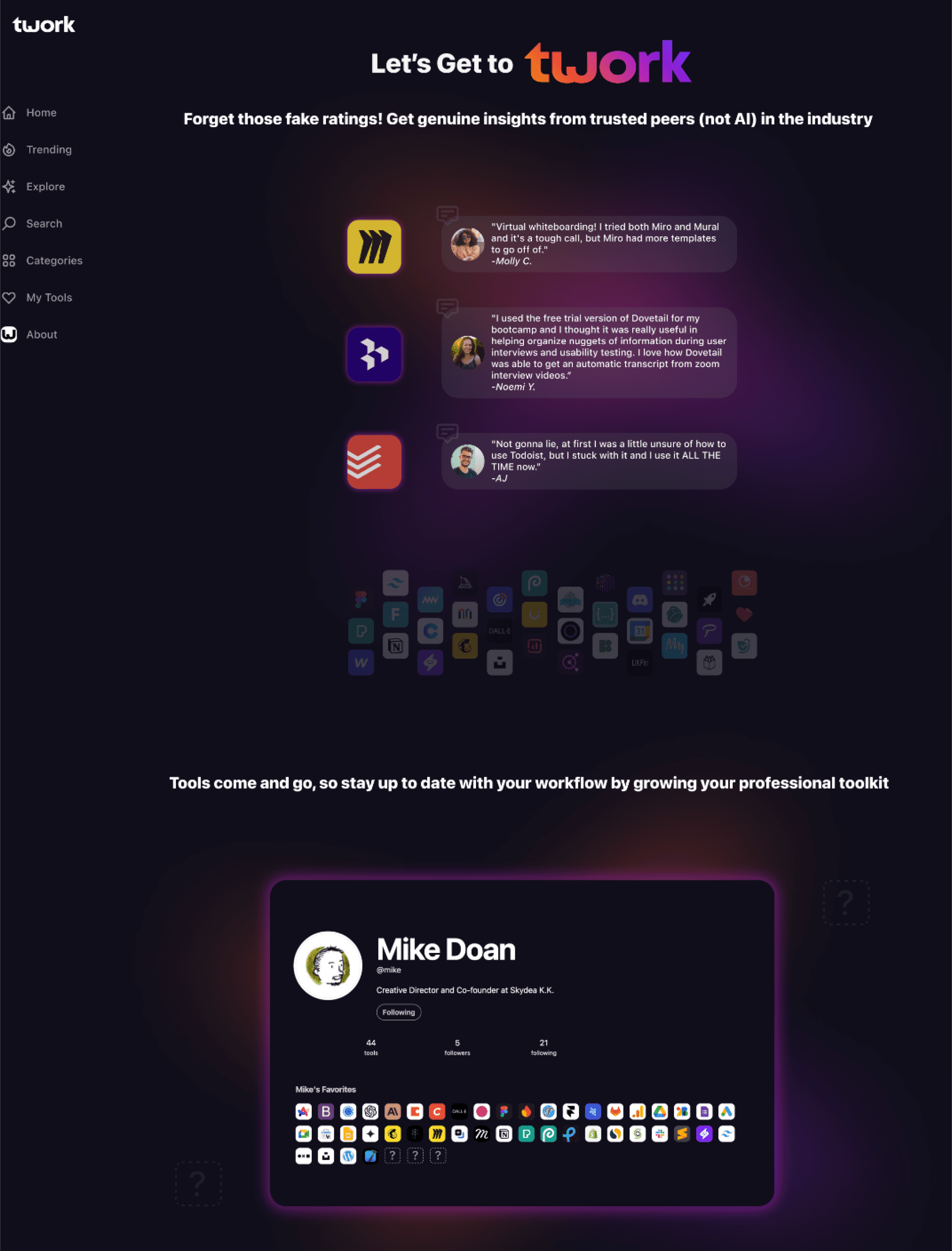
What Do You Use?
Quickly share your Twork toolkit. Your likes and reviews will help others find their next game-changing tool. Curious about other people in the industry? Discover their most loved tools.


"I'm really bad at organizing and planning. Notion is the perfect solution for someone like me, 10/10"
-Mick
Home
Trending
Explore
Search
Categories
My Tools
About
Bringing in the user with “you” questions
Bringing in the user with “you” questions
Toolkit visual/prototype features tools loved, liked,
and reviewed by TWORK members, emphasizing
the importance of community action.
Toolkit visual/prototype features tools loved, liked,
and reviewed by TWORK members, emphasizing
the importance of community action.
It’s important you stay up to-date
91%
of jobs require digital skills
1000+
AI tools available on the market
$3.4 T
global digital transformation by 2026


Home
Trending
Explore
Search
Categories
My Tools
About
Three, visually large, data points to inform users on
where the direction of the digital tools market is
going and how this could impact them
Three, visually large, data points to inform users on
where the direction of the digital tools market is
going and how this could impact them

Mike Doan
Co-founder of Twork

Hitomi Akibo
Co-founder of Twork

Florian Ludot
Co-founder of Twork

Alex Sebastiano
UX/UI Design

Erin Hamasaki
UX/UI Design

Jessica C.
UX/UI Design

Sarah V.
Graphic Design

Mick Smit
Marketing
Who Are We?
We are a diverse group of tech enthusiasts, passionate about connecting with people and sharing knowledge. Realizing the immense value in learning from one another, we created a community-led platform to highlight and share these insights!
Home
Trending
Explore
Search
Categories
My Tools
About
Introduce the team of real humans who are putting
this together ❤️
Introduce the team of real humans who are putting
this together ❤️
Users can click on each team member’s profile
and explore their digital toolkit
Users can click on each team member’s profile
and explore their digital toolkit
Why are we building Twork?
We understand that tools evolve over time, and keeping up with the market can be challenging. It can be difficult to filter out which tools are useful and worth investing our time, energy, and money.
How often have you read a review only to find it's sponsored or not written by real users? We want to change that. Twork is a space for genuine reviews and suggestions from real people.
Where did the idea come from?
Through hosting various events, we we noticed a recurring question being asked: "What tools do you use?" This sparked an idea: what if we could consolidate everyone's workflow details into one platform? This would provide equal access to professional development and allow people to improve their workflows by learning from peers across various industries.
What’s the future plan?
Our goal is to expand the Twork tool library, allowing users to discover and try new tools. Our focus remains on creating an engaging platform where people can connect and easily share industry tool knowledge. Together, we can build a community where finding the right tools is simple and enjoyable.
Our Story


Home
Trending
Explore
Search
Categories
My Tools
About
A story about TWORK and the team made into an
FAQ style format (quick and simple)
A story about TWORK and the team made into an
FAQ style format (quick and simple)
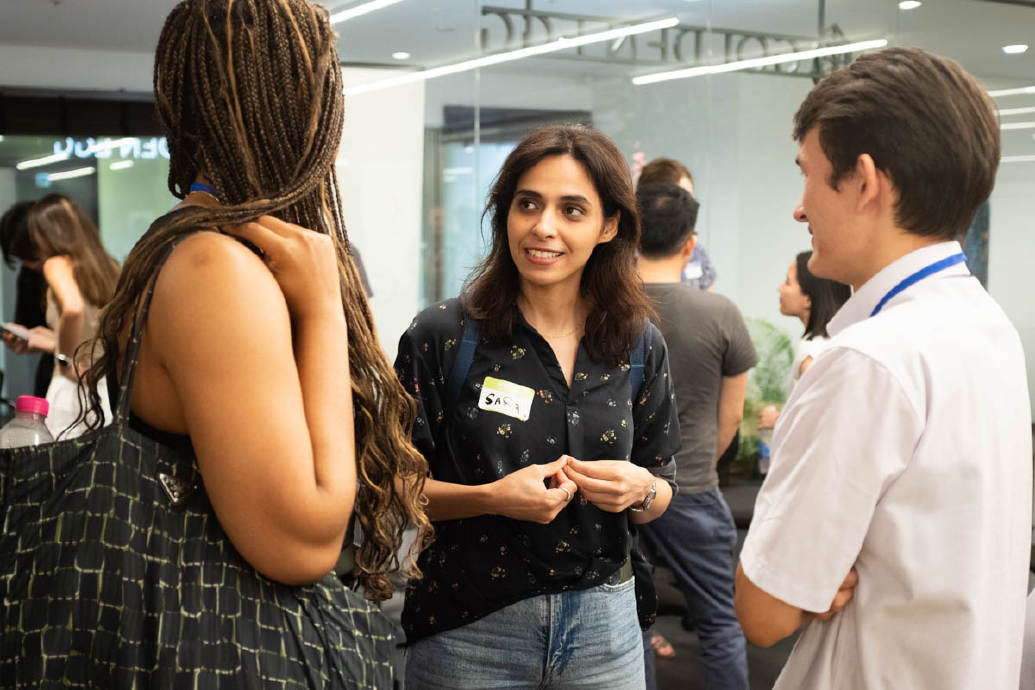
Images showing how the idea for TWORK
stemmed from in-person community gatherings
Images showing how the idea for TWORK
stemmed from in-person community gatherings
Tools for Work
With over thousands of digital tools out there, choosing the right one can be overwhelming. Twork gives you access to genuine insights written by real people to help you select the right tool for the job.
"I used the free trial version of Dovetail for my bootcamp and I thought it was really useful in helping organize nuggets of information during user interviews and usability testing.”


"As a dev/designer, Unsplash is my go-to to get free image placeholders. Images always looks cool and professional there.”


"My team and I use Gather to meet online and it's so fun! Its user-friendly interface and customizable spaces make it a convenient option for collaborative projects and casual gatherings alike.

"Shopify is the favorite go-to e-commerce platform. Its easy to get started with a small store with its simple and clean UI. But it also has enough features to handle a large scale store.”


"Honestly, this was a godsend for those times I didn't have Adobe Photoshop. If I needed to open PSD files or create them for a client, this was a good web-based alternative."
Home
Trending
Explore
Search
Categories
My Tools
About
Shorter, scannable headlines
Shorter, scannable headlines
Giving the page more room to breath
Giving the page more room to breath
Highlighting community members and their reviews,
showing how everyone is connected and helping
one another
Highlighting community members and their reviews, showing community support
For accessibility and feedback, I created a hover state
for items in the side navigation, which the previous
site didn’t include
For accessibility and feedback, I created a hover state for items in the side navigation, which the previous site didn’t include
Sign Up
Twork is just starting out but we’re on a mission!
We rely on amazing people like you to provide your valuable insights and suggestions. 🫶

Home
Trending
Explore
Search
Categories
My Tools
About
Last screen has a simple CTA using the brand colors,
calling for users to sign up + a message emphasizing
the importance and value of reviews and suggestions
made by the community.
Last screen has a simple CTA using the brand colors,
calling for users to sign up + a message emphasizing
the importance and value of reviews and suggestions
made by the community.
Testing the About page with five wonderful users
*I used Dovetail for recording and sorting
“...I have ADHD, so that’s why when
there’s too many things written, I get lost- I don’t know where to read. But that’s not the case here at all! It’s quite modern and I like the size of the visuals and how I’m not overloaded with information...”
👍🏼 User with ADHD doesn’t feel overwhelmed:
“...I like how the explanations are simple and there aren’t too many details that distract me or feel unnecessary...”
👍🏼 User isn’t overloaded with information:

“...I really like this visual animation where things appear as you scroll, to me it makes the page feel more curated...the structure of the page is also easy to follow...”
👍🏼 Visually pleasing and easy to use:

“...It could be good to show some photos of the team together, you know?...”
😞 Need to know more about the team:
“...Sometimes it feels like there’s no visual identity for this. Some areas of it feel a bit empty...
😞 Need a stronger visual identity:
“...I have ADHD, so that’s why when
there’s too many things written, I get lost- I don’t know where to read. But that’s not the case here at all! It’s quite modern and I like the size of the visuals and how I’m not overloaded with information...”
👍🏼 User with ADHD doesn’t feel overwhelmed:
“...I like how the explanations are simple and there aren’t too many details that distract me or feel unnecessary...”
👍🏼 User isn’t overloaded with information:
“...I really like this visual animation where things appear as you scroll, to me it makes the page feel more curated...the structure of the page is also easy to follow...”
👍🏼 Visually pleasing and easy to use:
“...It could be good to show some photos of the team together, you know?...”
😞 Need to know more about the team:
“...Sometimes it feels like there’s no visual identity for this. Some areas of it feel a bit empty...
😞 Need a stronger visual identity:
“...I have ADHD, so that’s why when
there’s too many things written, I get lost- I don’t know where to read. But that’s not the case here at all! It’s quite modern and I like the size of the visuals and how I’m not overloaded with information...”
👍🏼 User with ADHD doesn’t feel overwhelmed:
“...I really like this visual animation where things appear as you scroll, to me it makes the page feel more curated...the structure of the page is also easy to follow...”
👍🏼 Visually pleasing and easy to use:
“...I like how the explanations are simple and there aren’t too many details that distract me or feel unnecessary...”
👍🏼 User isn’t overloaded with information:
“...Sometimes it feels like there’s no visual identity for this. Some areas of it feel a bit empty...
😞 Need a stronger visual identity:
“...It could be good to show some photos of the team together, you know?...”
😞 Need to know more about the team:
Throughout this project I was met with a few challenges
Throughout this project I was met with a few challenges
🧐 Minimal Content
There were other features that I would have liked to include in the final iteration to make the page more cohesive, such as a timeline and community testimonials. However, as TWORK is new, there wasn’t much information to work with.
There were other features that I would have liked to include in the final iteration to make the page more cohesive, such as a timeline and community testimonials. However, as TWORK is new, there wasn’t much information to work with.
🧐 Design Brief
Reflecting, I should have created a detailed design brief to avoid making as many high-fidelity prototypes as I did. Presenting variations of low fidelity wireframes from the start would have been a better solution and I would have saved on time for everyone.
Reflecting, I should have created a detailed design brief to avoid making as many high-fidelity prototypes as I did. Presenting variations of low fidelity wireframes from the start would have been a better solution and I would have saved on time for everyone.
However, there were a lot of learning outcomes; here are a couple
However, there were a lot of learning outcomes; here are a couple
🤓 Working with Developers
Two out of the three co-founders are developers. I learned that what the designer wants to implement may not be built out by the dev. team immediately or dev. may need alternatives to my design plans.
🤓 Content is “King”
Content can dictate the path of your design. Without solid content, the design can be lacking and you won’t be able to bring in potential users.
Design Challenges:
Daily challenges - from Hype 4 Academy - to help polish and refine my skills


The page opens with the community based
comments that make TWORK what it is
The page opens with the community based
comments that make TWORK what it is
GIF showing when a user hovers over tool icons
that are glowing, community reviews appear 💬
GIF showing when a user hovers over tool icons
that are glowing, community reviews appear 💬
Headlines that inform
Headlines that inform
Users get a glimpse to what their public toolkits
will look like on the platform
Users get a glimpse to what their public toolkits
will look like on the platform
TWORK’s brand colors seen from the very beginning/incorporated into the gradient blur background
TWORK’s brand colors seen from the very beginning/
incorporated into the gradient blur background
To increase the amount of white space and
break up the sections more neatly, I opted to highlight just three apps with community ratings
To increase the amount of white space and
break up the sections more neatly, I opted to highlight just three apps with community ratings
Utilized a previously made asset to convey that TWORK has a growing library of digital tools to discover
Utilized a previously made asset to convey that TWORK has a growing library of digital tools to discover
The toolkit profile in 3A was too small, so I opted for increasing the size and to highlight one member’s profile
The toolkit profile in 3A was too small, so I opted for increasing the size and to highlight one member’s profile

Iteration A (sections 1 & 2)
Iteration A (sections 1 & 2)
Iteration B (sections 1 & 2)
Iteration B (sections 1 & 2)
Researching + identifying + iterations and more iterations + meetings with co-founders = FINAL 💪🏼
Researching + identifying + iterations and more iterations + meetings with co-founders = FINAL 💪🏼

Redesigning an About page to Intrigue Users

Roles
UX/UI: Me
Developer: Mike
Lead Designer: Hitomi
Year
2024
Skills
Research
Wireframing
Prototyping
Device
Desktop
Redesigning an About page to Intrigue Users
Roles
UX/UI: Me
Developer: Mike
Lead Designer: Hitomi
Year
2024
Skills
Research
Wireframing
Prototyping
Device
Desktop
What is TWORK?
TWORK is a social platform start up that allows users to quickly view digital tools favorited by their peers as well as their workflows. Additionally, users can write honest reviews about the various tools they’ve used, helping the community increase their workflow potential. TWORK helps with building transparency and promoting equal access to career development by having all of these tools and reviews consolidated into one platform.
What is TWORK?
TWORK is a social platform start up that allows users to quickly view digital tools favorited by their peers as well as their workflows. Additionally, users can write honest reviews about the various tools they’ve used, helping the community increase their workflow potential.
TWORK helps with building transparency and promoting equal access to career development by having all of these tools and reviews consolidated into one platform.

Competitor analysis findings
Competitor analysis findings

1
2
3
4
TWORK’s brand colors seen from the very beginning/incorporated into the gradient blur background
The page opens with the community based
comments that make TWORK what it is
Headlines that inform
Users get a glimpse to what their public toolkits
will look like on the platform
1
2
3
4
Iteration 3A (sections 1 & 2)
GIF showing when a user hovers over tool icons
that are glowing, community reviews appear 💬
1
2
3
To increase the amount of white space and
break up the sections more neatly, I opted to
highlight just three apps with community
ratings
Utilized a previously made asset to convey that TWORK has a growing library of digital tools to discover
The toolkit profile in 3A was too small, so I opted for increasing the size and to highlight one member’s profile
1
2
3
Iteration 3B (sections 1 & 2)

1
2
3
4
Shorter, scannable headlines
Giving the page more room to breath
Highlighting community members and their reviews, showing how everyone is connected and helping one another
For accessibility and feedback, I created a hover state for items in the side nav, which the previous site didn’t include
2
3
4
1

1
2
Bringing in the user with “you” questions
Toolkit visual/prototype features tools loved, liked, and reviewed by TWORK members, emphasizing the importance of community action.
2
1

1
Three, visually large, data points to inform users on where the direction of the digital tools market is going and how this could impact them
1

1
2
Introduce the team of real humans who are putting this together ❤️
Users can click on each team member’s profile and explore their digital toolkit
2
1

1
2
A story about TWORK and the team made into an FAQ style format (quick and simple)
Images showing how the idea for TWORK
stemmed from in-person community gatherings
2
1

1
Last screen has a simple CTA using the brand colors, calling for users to sign up + a message emphasizing the importance and value of reviews and suggestions made by the community.
1
Early iterations that helped create the final product
My findings and observations from above helped shape the path towards the final product. I knew that the About screen needed to inform the user of what exactly TWORK is, how they could benefit from becoming a member, and express TWORK’s core values of transparency and workflow development. I always made sure to present and have discussions about the iterations with the co-founders who also happened to be developers and designers.